Last year, when I was working on the cover for author Brian Keene’s A Gathering of Crows for Thunderstorm Books, I was asked if I could do a design for the foil imprint that was to go on the cover. Easy enough.
It’s a point at which my graphic design production background and my art met, as one could not live without the other.
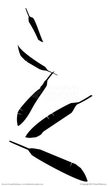
The concept we came up with was easy. To represent things that happen in the story, we decided to go with five crow feathers falling down the front of the book. The book was to have a white linen finish, with the black imprint/foil embedded in it. It’s looks something like this:

I toyed with the angle in a subtle way, so that it looked like the feathers were falling slightly towards us. It’s a simple design, but it adds something nice to the cover (which is normally covered by my illustrated dust jacket).
Now, I said the design was easy, but in execution there’s far more to it.
First off, I always think of how art will be produced at the end, and create my works accordingly. When an imprint like this is made, you basically (and I am really simplifying this) have a die cut to match, and literally press the design into the cover itself. There’s way more to it, but I’ll let you explore that on your own.
Easy enough right? Yes and no. Production-wise, you can’t just hand them a Jpeg file of the web and tell them to go at it. The lines on the edges of the image have to be perfect, else the design will look terrible when they make it. It’s akin to tearing out the shape of a heart with paper, or using a razor blade to cut it out exactly.
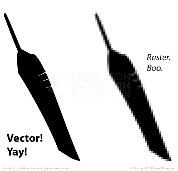
In design terms, we are using a vector design instead of a raster/bitmap. Designers would in this case be using something like Adobe Illustrator, as opposed to Adobe Photoshop. Here’s what the difference might look like:
Now, I’m exaggerating it a bit of course for humor (it’s funny… right?), but the point is still there. You use the right tool for the right job, and in this case we need to use vector art.
Next up, we can’t just have the same feather falling over and over. That looks exceptionally lame. Luckily, it’s very easy to manipulate vector art, you just manipulate the points.A little pull here, a little push there, and the feathers are all slightly different. I also overlapped one of them, to give, at least in a subtle way, the idea that they are falling together.
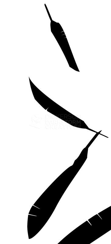
The last problem we face is that the method these are pressed with leaves things a bit loose. As in, when they are pressed, especially into something textured like canvas or a linen board, you’re going to lose the finer lines in it. In many cases that’s not such a big deal. In this case though, any fill at all would combine the slits in the feathers together, and could throw off the idea some. That’s fine for the one up top, seemingly far away. As they get closer though, at least some of that gap needs to stay.
Again, you don’t need all of it. Just enough so that there’s some indication of a line there. It will fill in some, and that’s fine as long as we have enough there to start with. You just zoom into the point levels, and scoot the curves and points out a little.
Then you send it off to the print shop, in whatever format they want (often a vector EPS), and at the right size. Though, to be fair, if it’s not the right size they can resize it all they want. The art, as a vector, is independent of resolution.
Foil and imprints like this can add a nice touch to the book, to give the owner something a little extra. If they decide they don’t like my dust jacket art (why in god’s name would you not like–), they can still show off their book with a nice design on the front.


