I’ve had the privilege over the last couple of years to work on a series of books by S.P. Miskowski, her Skillute Cycle series. The latest, and final, book in the series is called In The Light, and I recently created the art for it as well.
Her books have a certain mystique to them, and an embodiment of place that is both real and supernatural. The books themselves have each had their challenges from the art side, especially in not creating a cover that gives away the entire story. A cover illustration should entice someone to pick up the book, or stop and look at it at least, and hopefully purchase it.
The challenges with a series of covers, combined with the challenges of creating a relevant illustration for an individual book, can be a little overwhelming. Each cover in a series tends to have similarities to the others, and in most cases should. Those similarities, in font choices, layout, even color, inform the viewer that this is all part of the same story.
Each of the Skillute Cycle books has those similarities, despite the feel of each book being slightly different than the others. It started with the cover for the first book in the series, Knock Knock. The cover art for Knock Knock is called Eternity in the Old North Hall, and wasn’t originally created for the book. I had painted it just as a personal piece, and S.P. Miskowski thought that it fit perfectly with her story. I designed the title text, and it was published.
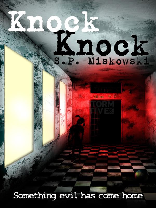
Even though Eternity in the Old North Hall wasn’t originally created for the series, it did lay the groundwork for all of the covers after it. Scenes with open spaces, lone figures in their landscapes, even the mystery of who they are. There is also a “lightening” of the covers as they proceed, from this very dark image to the final, very bright image.
My cover for Delphine Dodd, the next book in the series, is arguably the creepiest of the the stories. In the book, the exact scene that is featured on the cover plays out in all its glory. The cover art doesn’t always have to exactly match the story, it can even be abstract. But in this case, the creepiness of the scene is a perfect explanation of the book itself.
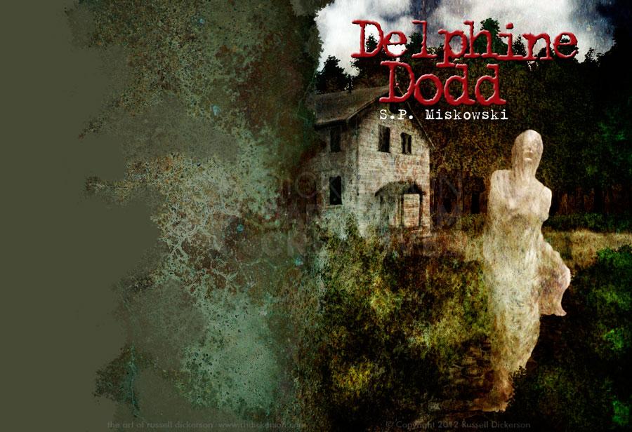
Again, we have the lone figure, in an open space. The design is similar, with the same font. The scene is lighter, though with the texture it’s still pretty dark. This is the first book that has a wraparound cover, moving from ebook to print book by publisher Omnium Gatherum. The wraparound allowed for the creepy texture to be infused throughout the piece, something that influenced the design of the next book as well.
With that next book, Astoria, my cover art is truly split between the dark and the light. The tentacle-like branches of the dark back cover give way to the bright blue of the front cover. The story itself is much more in the light, so to speak, than Delphine Dodd was, and my cover art is intended to show that. We’re still with the open space, the lone figure, and the same fonts, but we’re escaping the dark a bit here. Or, at least trying to.
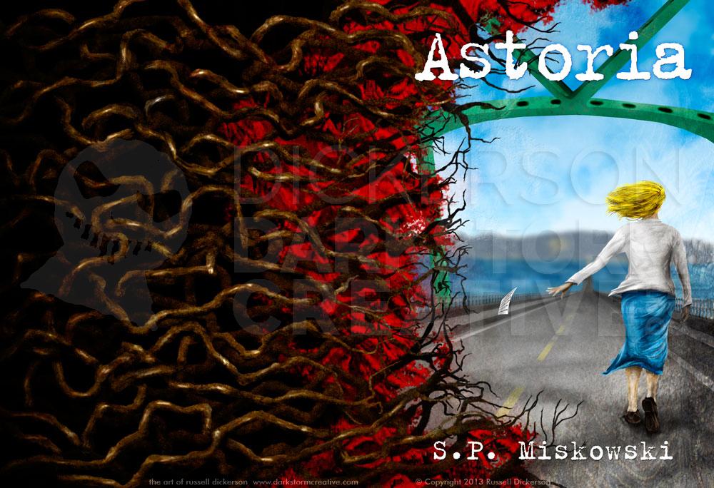
With that brighter palette, much like the story, we’re fighting between the light and the dark. Which brings us to the final entry in the series, In The Light. Being the final entry in the series, there are even more challenges than before. The previous covers have established certain look and feel, a consistency, that works well. Developing a new cover can be a challenge, since it needs to serve both the current book and those that came before it.
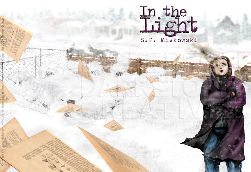
Luckily, the author gifted me with a perfect premise: partway into the final book, there’s a massive snowstorm. Since no problem existed with the idea of light any longer, it was more about creating an effective scene.
Crafting effective cover art is not as simple as just another illustration for a book. With illustrations that are within the book, for example, the illustrator is trying to effectively get across the individual points in the story. If you refer to my article about my interior illustrations for Four Ghosts, for example, those are each specific scenes that are happening on that very page in the book. I can paint exactly what is happening, spoilers be damned, because you are reading the paragraph where it happens.
Cover art is a different animal. You can show a direct scene from the story, like Delphine Dodd, if it at the same time is giving you the feel for the book. You can also do something more like Astoria, that modifies scenes and ideas from the book, but is meant to represent the overall book itself over a specific scene. You have to grab someone’s attention, but not give them every little detail. The cover is meant to intrigue them, not hand them the story on a silver platter.
In the 21st century, a good artist and designer will also consider marketing and sales in the cover design. For many years, covers were designed with bookstores in mind. Your cover had to pop right off the shelf, to get the attention of someone walking by. These days, your cover still needs to pop, but now many people are looking at it only online.
This is what a lot of people see when they search for Delphine Dodd:
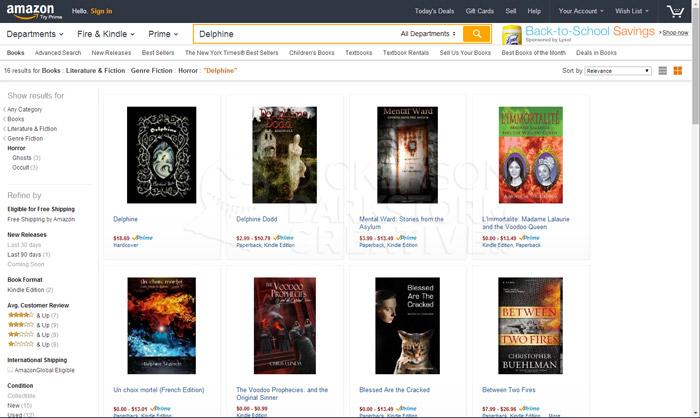
Often online, books appear in a grid of other books of the same genre. Shopping nowadays consists of looking at these tiny little thumbnails (though, some stores like Amazon are getting better about it), and deciding only on that tiny vision if you’re going to look at it or not. The cover lives in an ocean of others like it, so it’s a consideration when creating cover designs that it stands out however it can. It has to look professional, with nice art and design, and have enough contrast to show well in the crowd.
It’s even worse on some sites, with thumbnails that are barely there:

At the end of the day, though, I’m here to represent the story. I have to keep all of those things in mind, of course. But the cover art must serve the story, and the idea that the art needs to represent and sell what’s between the covers.
With my newest cover for In The Light, the challenge and the gift were one and the same. The snowstorm that effects everything in the book brings us into the light, both literally and figuratively. The biggest challenge was in how to show the details of the story, without just having a plain white cover.
I mean, it’s snow, right? That means the cover should just be white, and I don’t even have to worry about the details.

In reality, the snow almost makes it more difficult as a cover. Sure, I don’t have all the detail work to do (I spent all of that detail time on my Karloff Mummy ink anyway). I don’t have to paint all of the branches as I did with Astoria, for example.
But that’s the deception.
When you’re talking about a snow-covered landscape, especially one that’s in the middle of a storm, it’s not just a whiteout situation (unless, of course, it actually is). There are objects around and under the snow, each with its own highlights and shadows. The trick is how to show that there are still plenty of objects in the scene, because if you don’t have objects in the scene you lose all sense of place.
There are plenty of shadows, for example, in a snowy scene. Walk out on any snowy day, and you can still tell where the tire tracks are, or the subtle shadows as the snow piles up and over something on the lawn. There’s the underside of bushes that you can see the branches of, despite the inches of snow over the top. In a storm, as well, you’ll still see the outlines of trees and larger objects in the distance. There’s a lot of detail still yet to see in a snowy scene, and a great deal of inferred objects and textures.
Here’s the real cover, before I added text. Click on it for a larger version:
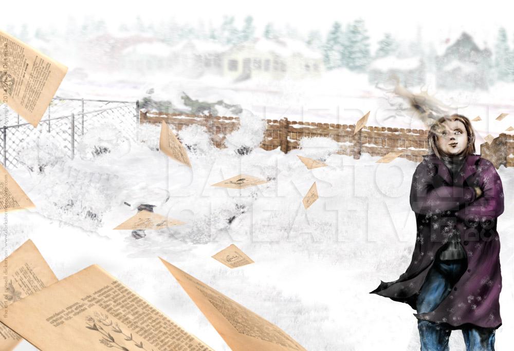
Bringing that all to life was a big challenge of the In The Light cover, but not its only one. The main character featured on the cover, for example, is… complicated. I won’t spoil the book (which you should go buy here), but the hope is that I managed to bring both the innocence and the darkness of the situation into a clear notion of what the story is about.
One other complication occurred with the swirl of pages in the image. The original idea was to have them swirl in as snow on the right, turning into larger and larger pages as the swirl moves to the left. The problem with that idea is that you’d never see the snow on the right side, since the background is all white. That meant altering the idea a bit, but in the end the current idea gives a much more dynamic sense anyway.
Here’s the cover art with the final text on it. As always, I’m curious to hear what you think.