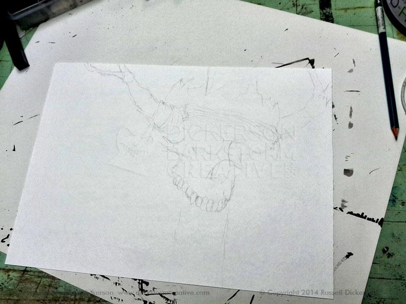
I’ve been wanting to work in more color with my inks, and I’ve had a number of ideas run through the old noggin. I thought it would be fun to try an experiment with ink and color, so I started in with a sketch of a skull.
Not just any skull, of course. I thought that having branches attached to it, like antlers or horns, would be fun. I also thought it would look interesting if the skull rested on a wooden pole, or maybe partway down, so I sketched it out. As with all of the pieces on this page, click on the image for a larger version.
I considered, briefly, filling in the background with black. That’s a pretty common theme with me, it could almost be considered a style of mine. But I thought it would be more fun to add color to the whole thing, then come back in with black ink and create lines around all of the random patterns that the color would create.
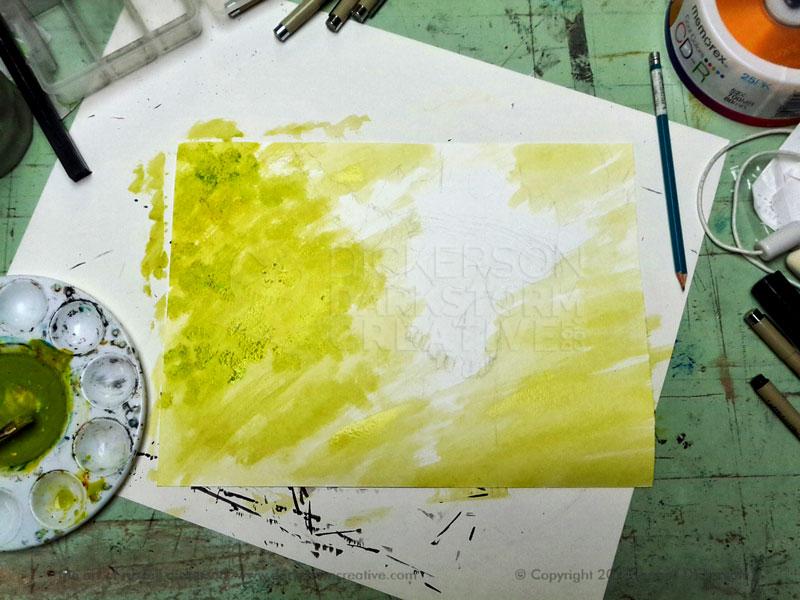
To start that process, I grabbed my acrylics and started some mixing. Now, if you’re here for me to tell you all the ordered, scientific means of working with colors and palettes, you’re in the wrong place. My technique is more along the lines of, “throw color in the thingy until it looks like I want it”.
I watered down a rough combination of yellow and green acrylic, and started painting it on the stock (140 lb. Cold Press watercolor stock, as usual). The rough mix worked great, as it left streaks of more solid green and yellow in spots. I was looking for that randomness, as opposed to a smooth image.
After the yellow/green/pukey color was all over everything, I added a little brown (officially “burnt sienna” and “burnt umber”) to the mix, and roughly painted in the darker color. That added a nice dimension to everything, especially using the slightly more reddish Burnt Sienna.
I felt I was losing the contrast a little, so I watered down some black acrylic to darken the edges. That brought the focus back towards the center a bit more. I used a fan brush to do that, and by giving the brush a slight twirl at the end of the stroke I ended up with a very nice, directional flow to the edges.
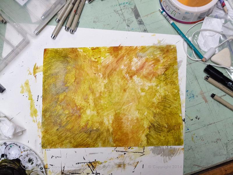
The only problem with all of the nice color is that it nearly washed away the original sketch in the background. Luckily, there was enough there that I could pick up the idea, and pretty soon I had the crosshatching done for the skull and the branches.
I then started working on the details of the random background. I’ve used this effect before (check out this monster here), and it’s a fun, if tedious, method. You can see it on the right side of the image.
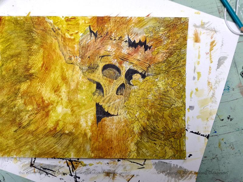
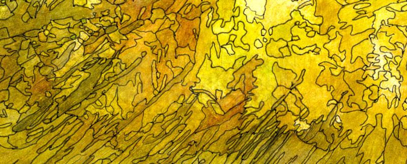
I was basically picking up on the random color shifts in the acrylic, and using my Micron 01 pen to follow the intricate paths. It creates an almost puzzle-like effect, and gives the image an interesting flow. Here’s a closeup view of the effect:
The effect, combined with the skull, was working pretty nicely. But there was something that just bugged me about it. I couldn’t put my finger on it, but it just seemed like the skull was so… normal.
So I lost my mind for a few moments.
I took a brush with some heavily watered down white acrylic on it, and started brushing over the skull in line with where the wooden post would be. That wasn’t quite it, so I took a paper towel and very roughly wiped off some of the white. That, of course, picked up a lot of the black ink and color acrylic that was already there, and even roughed up the paper some.
Now I was getting somewhere.
I kept doing that all up and down the image, in line, still, with where the post would be in the image. I then decided it wasn’t enough, so I grabbed some “very fine” sandpaper, and really went at it. I didn’t want to entirely lose the ink out of it, more like I wanted it to look like the ghost of the original.
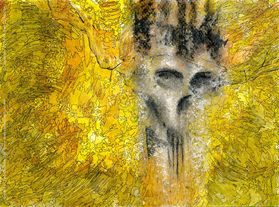
The ghost idea struck me as pretty interesting, so I added a touch of watered down white acrylic over the area. Then, since my mind was already somewhere else, I grabbed my charcoal pieces and added shadowing effects on the remains of the skull. Not just around the eyes, nose, and jaw area, but also at the top. I was hoping for a dark, evil “crown effect.
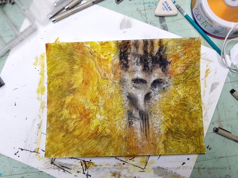
I felt this looked pretty nice, pretty creepy, which let me relax some. Experimenting like this can lead to some great ideas, but it rides along a line of serious disaster too. Sure, I’m an experienced enough artist to generally know where I’m always going. But I have plenty of failed pieces, especially on the experimental side.
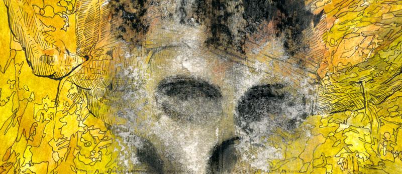
Here’s a closeup of it, and I think the contrast of the loose skull versus the intricate ink is a nice effect:
In this case, I liked this creepy “invasion” of a different technique, and I went with it. I went back to adding all of the detail in the color with the ink pen, then scanned it in and adjusted in it Photoshop.
Here is the final piece, it’s 9″ x 12″ on 140 lb. Cold Press. I call it, Here at the end of the line.