A few things have been rolling around in my head this week. First, the fact that my son used up all of my larger watercolor stock. Second, there have been a lot of Lovecraftian and “King in Yellow” ideas in my brain, probably because I binge watched True Detective the week before.
After picking up some new 140 lb. Cold Press watercolor stock (and briefly considering 300 lb. hot press stock), I decided to work out the art ideas from the brain. I’ve had these visions of skulls and branches in there, and sort of a “weird” monster kind of idea, and I started first by sketching out some ideas in my Moleskine sketchbook.
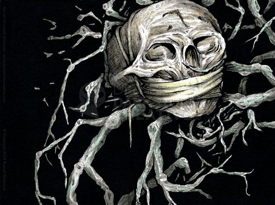
The final idea, as you’ll see, isn’t necessarily “monstrous”. But some of the nature and skeletal ideas remained. Just as a note, the walkthrough below covers both the ink itself, and how I worked with it digitally to post online.
First, to the sketch. I had a pretty clear idea in mind this time, after working it out through the Moleskine sketches beforehand. The execution, of course, can change things a bit. But in this case, it’s still pretty close to the original idea.
Click on all of the images on the page for a larger image. Also, while the tablet takes decent pictures, it’s not always perfect. Forgiveness, ahead of time.
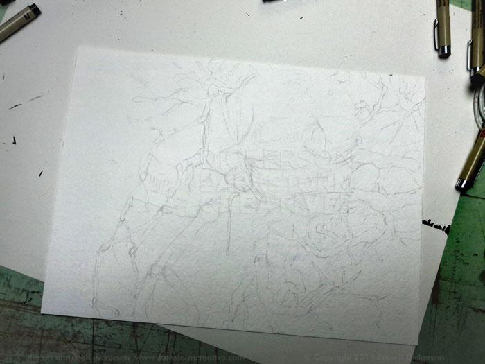
Branches can be tricky, weaving in and out organically but still within perspective. I decided up front to limit the number of branches I wanted to show, mostly for effect.
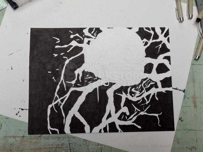
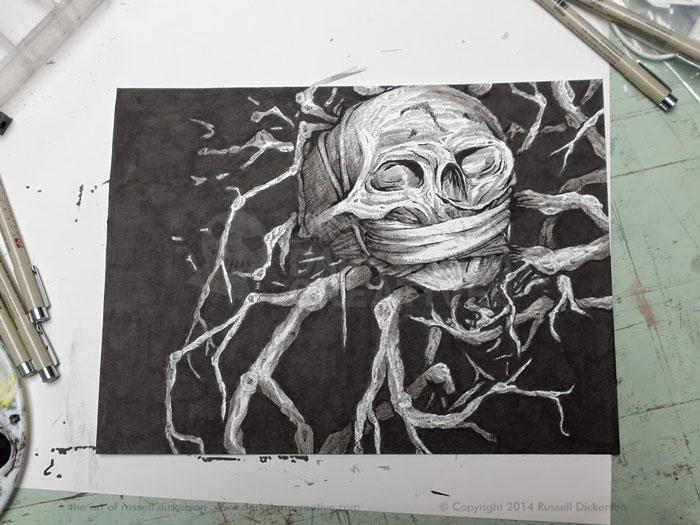
After I was happy with the sketch, I decided to lay in the black background with my Pitt Magic Brush. The Pitt is just the first step, it doesn’t leave a true black on the first go. But it does let me know where things are going.
I would also add, sometimes I start with the objects and crosshatching first, other times with the background. In this case, I thought the background would help define it better as I went. It does lead to the chance that I could end up wiping ink across an area I wanted to keep clean, which is something to keep in mind.
After all of the black areas were in, I started in on the crosshatching. I wanted it to have a specific look, a sort of “lined” look, so I first inked in some heavier lines in spots.
I also used a lighter 01 Micron pen to create “texture” lines here and there, giving me in essence guidelines to ink between. You can see those on the forehead especially.
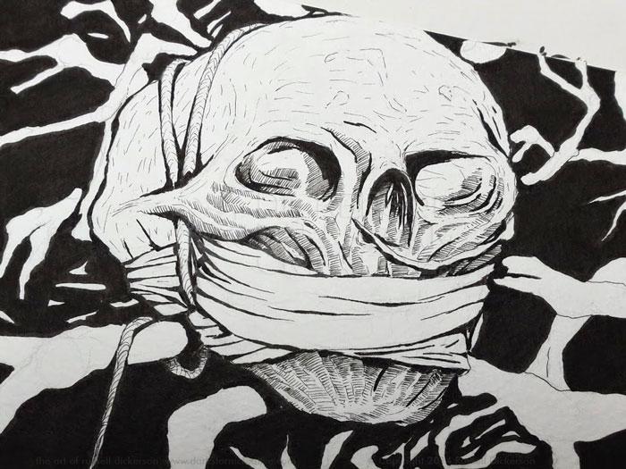
Then we crosshatch, and we crosshatch, and we crosshatch, and we crosshatch…
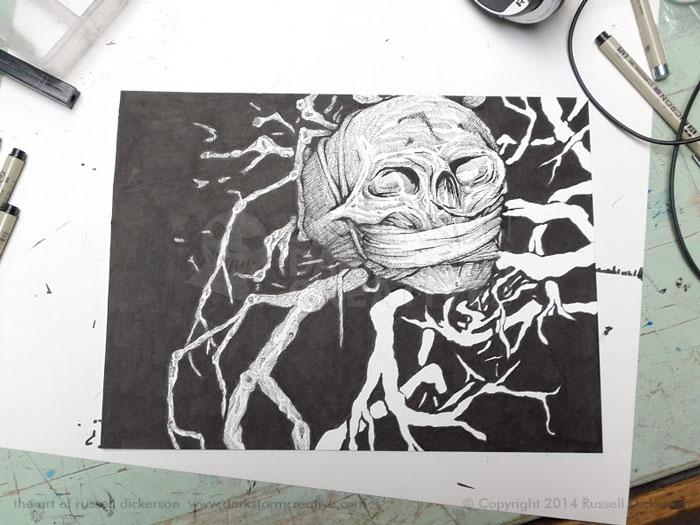
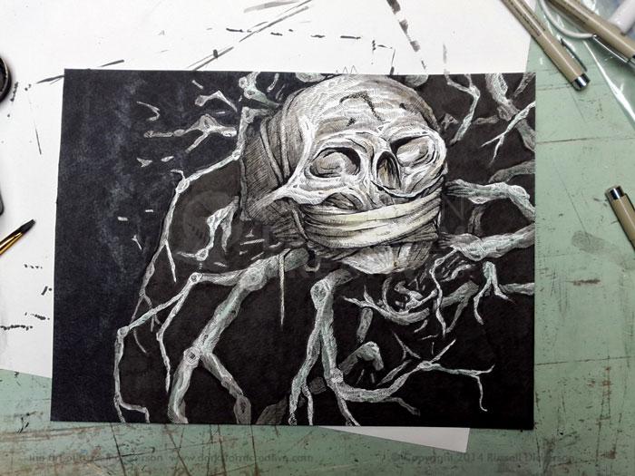
Once I was done with all of those lines, and a quick look through the whole thing to make sure I didn’t mess up the branches pattern, it was time to give it an ink wash.
If you aren’t familiar with the term “ink wash”, it’s just a fancy way of saying I painted it with watered down ink. You basically water down the ink to a lower percent, maybe 10% ink or even 20%, then brush it on with your favorite brush.
Ink wash can really highlight a piece, and bring out a lot of subtlety. It’s also a great chance to ruin a nice, crosshatched ink piece, so there is a danger there. After considering it, I loudly screeched “YOLO!” and went to it, watering down my Higgins Black Magic ink.
Okay, I didn’t really yell that.
I gradually painted in the ink wash, building it up to make certain areas darker. Essentially, that just means painting in a fairly broad area of the wash, then waiting briefly while that dries. Using watercolor stock makes that very easy, and it keeps everything from warping. Then you just keep doing it over and over again, often in smaller areas, to get deeper gray colors.
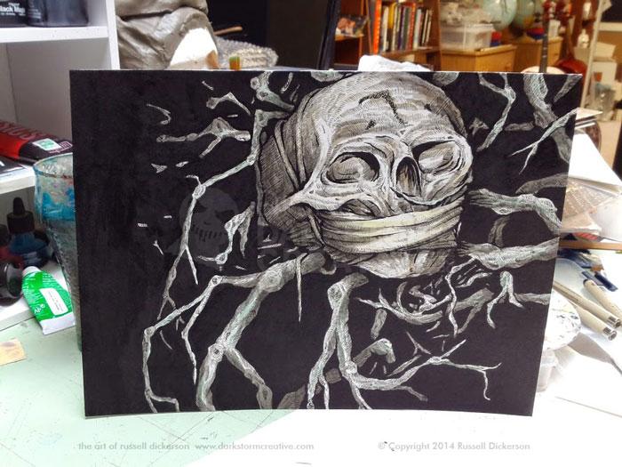
At this point (after explaining to the family why I yelled “YOLO!” at 1 in the morning), I decided to add some color to the piece. If ink wash is “kind of a dangerous step”, then adding color is a “jumping right off the cliff” issue.
I decided that some subtle color would be nice, though, so I watered down some of my acrylic colors to touch up only small areas of the piece. The watered down acrylics are the same effect, they are very light and it takes a few times to make the color stronger.
I then took a few brushes, and started painting in the black areas with a final coat of Higgins Calligraphy ink (#44314). Why not stick with the Black Magic you ask? I just think the calligraphy ink, from a bottle I occasional refill from the original 1990’s purchase, gives a very solid, very dark black.
Below, you can see where I’ve painted it in, and the difference between where I have not. The calligraphy ink does give it a slight shine in spots, which the camera picks up even more than seeing it real life.
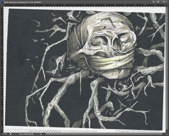
After that, we have our final inked piece. As far as the art is concerned, and the framing side, it’s done.
After letting it dry for awhile, I scanned it in to Photoshop to make it ready both for print (if needed) and for promotion online.
The ink itself is larger than my scanner, so I need to apply a couple of tricks to make it all work out. That starts with scanning one side of the art, then flipping it around and scanning the other. Here’s what I end up with in Photoshop.
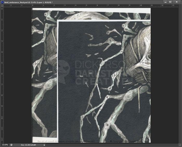
I made sure to overlap the scans, to use in the next step. I cropped out the shadows caused by the glass being lower than the scanner’s plastic exterior, then put both sides into the same file.
Using Photoshop’s “auto-align layers” feature, since I let the overlap stay in the previous step, Photoshop aligns the halves and expands the document to fit the full image.
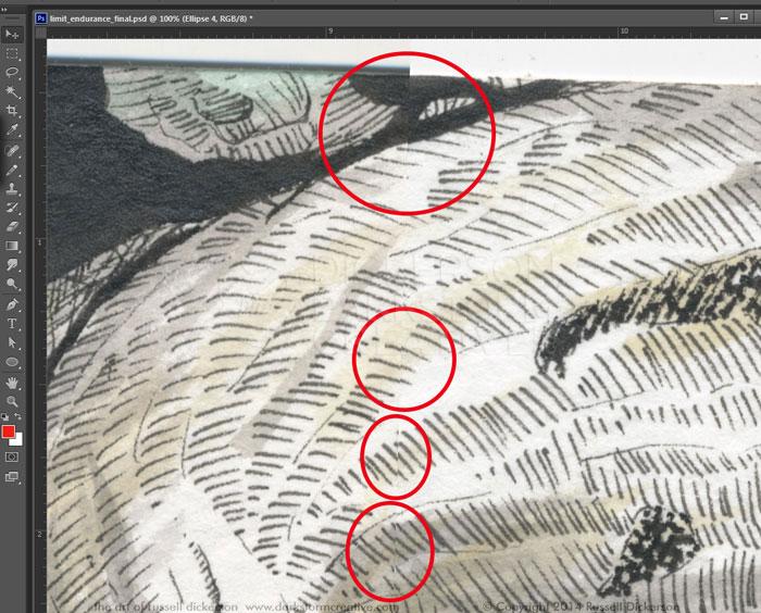
Now, Photoshop normally does a great job of this, and it looks great above. But it’s not always perfect, and you can see below where things are a little off alignment. In this case, it’s not too bad, and nothing that can’t be fixed with Photoshop’s Spot Healing Brush.
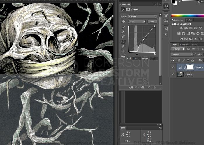
After healing any misalignments, I combine the layers together. Then I use a Curves Adjustment layer to balance the contrast and grayscale levels in the image. In some color images, I might also enhance the colors themselves. In this case, not only do they look fine, but I want to keep the subtlety anyway.
In the image below, I’ve saved a “before and after” to see the difference between my curves settings and the original.
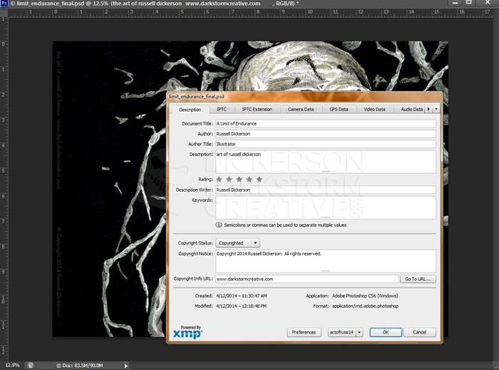
After those adjustments, I then go into Photoshop’s “File Info” screen to update the metadata. Each image that I work on has the metadata included, to cover such things as copyright, title, my name as the illustrator, and so on.
In this day and age of images flying across the web freely, I want to make sure that my information goes with the image. I have a subtle copyright overlay on nearly all of the images I post online, and the metadata adds a second level to the images. That way, hopefully, someone will be able to identify me as the creator of the work in the future through multiple means.
After that, I save it as a Jpeg file and start showing everyone on the earth my new image. You fine folks, however, can see it right below here.
I call it, A Limit of Endurance, and let me know what you think of it.
One thought on “Ink Art: A Limit of Endurance”
Comments are closed.