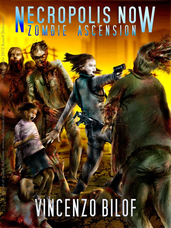
Last year, I created a cover for author Vincenzo Bilof’s Necropolis Now: Zombie Ascension. So, as is sometimes the case and something I look forward to, he asked if I could create the art for the book’s sequel, the now-released Queen of the Dead: Zombie Ascension II (go get it here).
 Most of my year has been taken up by my art hiatus, from doing nearly any kind of art at all. I’ve done a handful of art pieces, as you can see on my site. But being away from it has had two interesting effects: my daily art skills have suffered, but my imagination has become sharper and sharper.
Torn between the two, I think I end up with pretty good image ideas (if I don’t say so myself), but I lack the confidence to pull them off. I used to have that confidence, or at least nearly so. The last couple of years have been extremely destructive, though, so returning to the world of art has been a huge challenge.
With the new cover, I wanted to push forward and really get back into my art. It worked out in some ways, others were a great struggle that I’m not sure I can get back from. Luckily, Vincenzo is a very good author, and he’s not only wonderfully supportive, but he’s very patient too. I’m lucky that I work with great folks like that, from S.P. Miskowski, Vincenzo, Paul at Thunderstorm, Brian Keene, and the list goes on and on.
I fought through, and created a cover image that I like quite a lot. As an experiment, Vincenzo and I also posted the near-final art for feedback from the masses. It was a great experiment, and it was wonderful to get feedback that I never do. I had no real comments when I posted it, but Vincenzo posted the cover to ask for opinions, and we received some great ones.
Now, I’ve been an artist and graphic designer since the stone ages, so I know which comments to listen to and which are merely opinions. We certainly found lots of opinion-related remarks. Things like, “she should be positioned this way”, or, “the zombies should look that way”, ideas that, while possibly interesting, don’t really work with what we were going for. You can see the final cover below, after all the walkthrough stuff. Skip to the bottom if you want to see it, then come back and keep reading (pretty please?).
We certainly ran into those folks who just didn’t like the art, which is perfectly fine. Some of them did feel they needed to be “holier than thou”, which I always find funny. Those are always the ones I don’t listen too, since they are so stuck in the world of doing things in one way, their opinions become irrelevant.
Luckily, there were quite a few folks with wonderful feedback. Slight errors here and there, maybe lightening or darkening areas for effect, possibly making the text a certain way. Great feedback, and comments that were very respectful that helped a lot.
It was a great thing to try, and we certainly had WAY more comments on Vincenzo’s posts than on mine. It’s something I might try again, if I can somehow get that anonymity to post so that people are truthful in how they feel.
That all said, on to the art.
Since I did things a little out of order when I created it, this walkthrough is a little more about the look than a literal step-by-step article. The idea is the same, but realize that I did nearly everything on this out of order. But it’s still easier to show you this way.
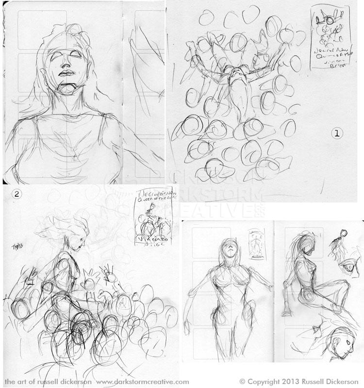
First, I passed a bunch of sketches to Vincenzo, to try and whittle down what we wanted. He had mentioned early on the idea of the main character being carried like a queen, like the title of the book. Since that very scene happens in the book, and I felt it would make a good cover, I started there. Click on all of the images as you go, for larger versions.
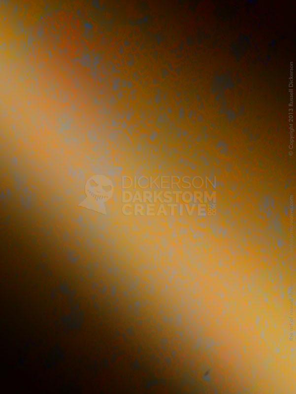
We agreed that the shot from above would be a bit different, and a fun image, so I started to create the full image. First, I created a textured background that I liked. Sometimes I’ll start with the background, to set the tone of the piece.
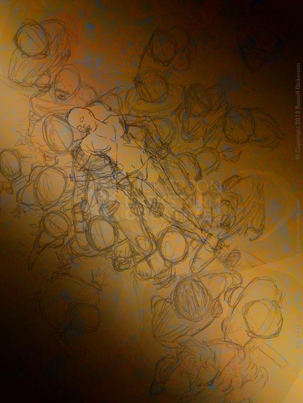
Once that was there, I put the sketches on top of that. I created some new sketches in Photoshop, others came from scans of sketches I created in my sketchbook. I worked them over until I liked where everything was at.
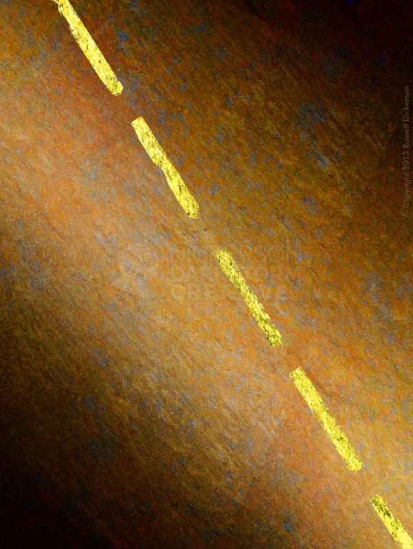
I turned off the sketch group in Photoshop, and reworked the layers a bit. I thought the background needed more of a “road” texture, so I added that and a yellow dotted highway line through the middle. The line helps to lead the viewer’s eye in the final piece, and give a sense that we are in motion here. It’s also sets a location, and even though it’s mostly hidden in the final piece it still helps.
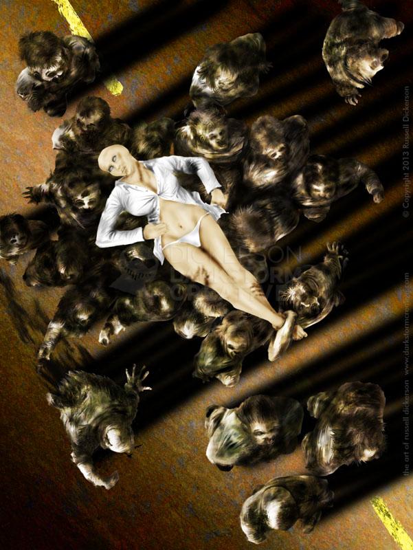
I then painted the zombies in place, more or less as a group. I painted each one individually, but they are on the same Photoshop layer. So it was more like traditional painting, versus having each one on a separate layer. I find that I work each piece of art a little differently, some have their own layer, some don’t. It’s just how I’m feeling at the time. In this case, considering how bright the main character looks later on, I wanted the zombies to be further back, more subtle in the image. Almost non-descript, and yet still horrifying.
At this point, they are all gray as well. Sometimes I paint the full colors as I go, sometimes I just paint them gray and come back to it. It’s just something I decide as it’s going, and I let the technique run instead of trying to fight it. I also left Mina, our “queen”, out of it for now. Hence the big white area in the middle.
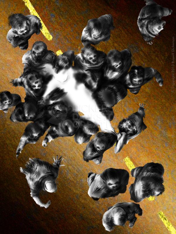
Since it looked like the zombies were all flying, I added deep shadows to the ground. The light, I felt, was actually coming from multiple directions based on the scene in the story. But I thought the shadows would add a great depth to the piece, and hopefully drama.
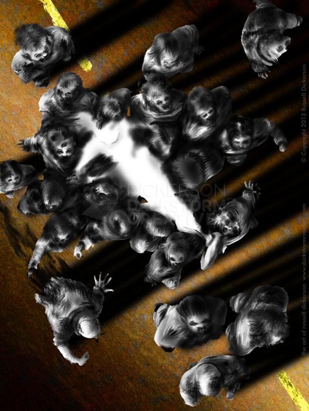
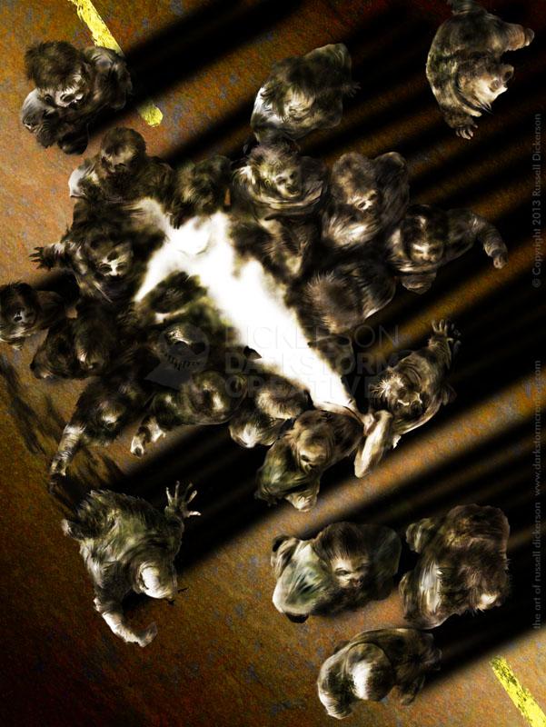
I then added some colors and textures to the zombies, to give them a bit of reality. Based on a few later suggestions in our feedback, I also went in and added touches of color here and there. I think it did improve things a little, but I also wanted to keep the subtlety in the piece as well.
In the story, the titular queen (you’ll see what I did there in a moment) is described as being a former, famous porn star. She is the very definition of eroticism and sex, and yet there is a simplicity to what she does. She follows the main character around, despite the horrible things he does. So the trick was finding aggression and passiveness within the erotic. She isn’t innocent, but she may be no devil either.
Which makes these things not just challenging, but fun as well.
I prefer to paint women that are realistic. Not from the photographically real side of things, but I mean to say women that look like they could exist. Anytime I look at a comic, for example, it’s always naked women with big boobs and nothing but shapely curves. But, for me at least, that’s not what defines how a sexy woman looks. I want realistic curves, certain poses, and a sense that this woman oozes sex.
That’s not so easy to pull off, especially when she’s being carried by rough zombies.
It challenges everything that I do, every skill that I have. I fight with my brain to get the right kind of curves, that the anatomy is correct, and that there is a smooth, silky feeling to the skin. It’s not easy, and I hope that I managed to get it right with Mina.
Okay, enough putting it off. I painted in her naked skin, which is sometimes how I start. In this case, she’s mostly naked anyway, which makes sense. So I painted the clothes and the skin at the same time. But sometimes it does work out better to get a sense of the body parts underneath, then match the clothes to them.
Now, some quick caveats. Without her hair, I understand she looks… odd. Keep in mind though that the hair is on a separate layer, and, for me at least, I like to create the bald head first to make sure I have the anatomy correct. You can also see some of the shadows of zombie hands that aren’t there yet, a by-product of, again, showing you this out of order.
After I thought she worked fine, and worked well with her positioning on top of the zombies, I added her hair in. I didn’t go for the “Brave” Merida hair, since that isn’t what the character has. Her hair would seem stringier from the story, almost wet, but not the big, flowing red hair. That’s straight from the story, folks.
I also added some more zombie hands holding her up. I had thought about doing it, and the feedback we received supported that notion, so I went with it.
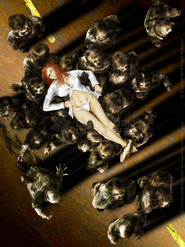
I had also considered giving her a slight bit of texture, but I was hesitant because I wanted her to sharply contrast the monstrosities that were carrying her. But the more I thought about, and with good feedback from both Vincenzo and from the crowd, I added a bit of subtle texture to parts of the body.
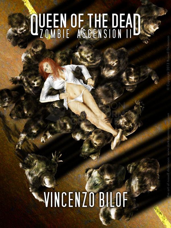
Here is the finished cover, and the text on it in the image following that. Don’t skip out, though, there’s more about the back cover after those two images.
As for the text, we tried to keep the fonts and layout as similar to the first book as possible. That consistency can be important in a series (though not necessarily always), and it worked out well here.
Here is the final cover for Queen of the Dead, with and without final text design. After these two, check out the back cover at the bottom.

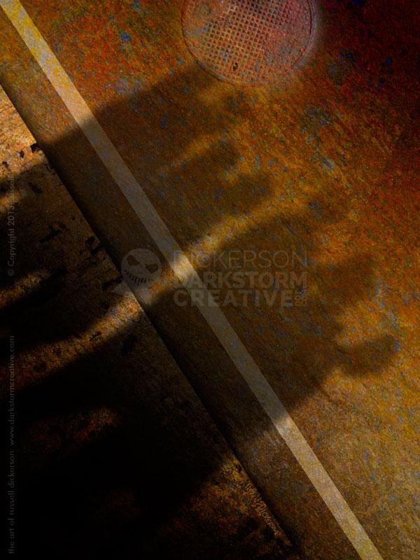
With the back cover, we needed to keep it simple for the back cover text. But we wanted a similar effect to the front, so I decided that that zombies were all on the same road. This is the other lane of traffic, near the sidewalk, and the shadows of some zombies made a very interesting design.
Let me know what you think of the covers, either below or on my social networks. Feedback is always great (hint).