Colors

Designing Foil Stamps for Covers: Maelstrom Set #2
Designing Foil Stamps for Covers: Maelstrom Set #2
Artwork, Design, Russ's Art Blog
New Movie Poster: Something Wicked This Way Comes

New Movie Poster: Something Wicked This Way Comes
Artwork, Design
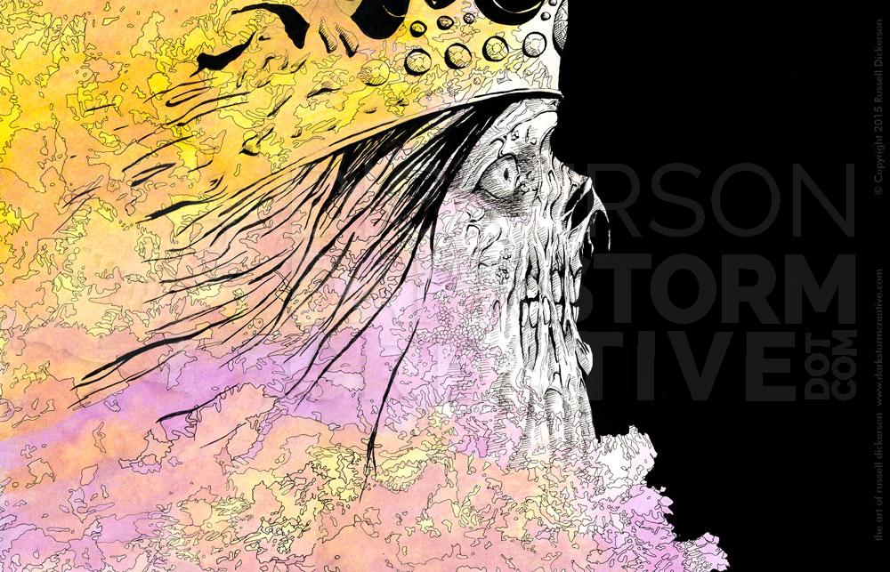
New Ink Art and Alphabeast: Unseelie
New Ink Art and Alphabeast: Unseelie
Alphabeasts, Artwork
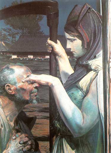
Russ’s Art Talks: “Acrobats”, Victor Vasnetsov
Russ’s Art Talks: “Acrobats”, Victor Vasnetsov
Russ's Art Talks
Russ’ Art Blog: The Young Lady with the Shiner
Russ’ Art Blog: The Young Lady with the Shiner
Russ's Art Blog, Russ's Art Talks
Russ’ Art Blog: Death on a Pale Horse
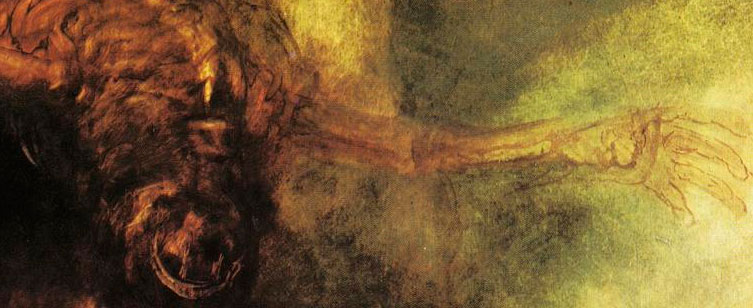
Russ’ Art Blog: Death on a Pale Horse
Russ's Art Blog, Russ's Art Talks
Russ’s Art Blog: And the sea gave up the dead
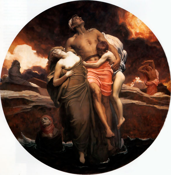
Russ’s Art Blog: And the sea gave up the dead
Russ's Art Blog, Russ's Art Talks
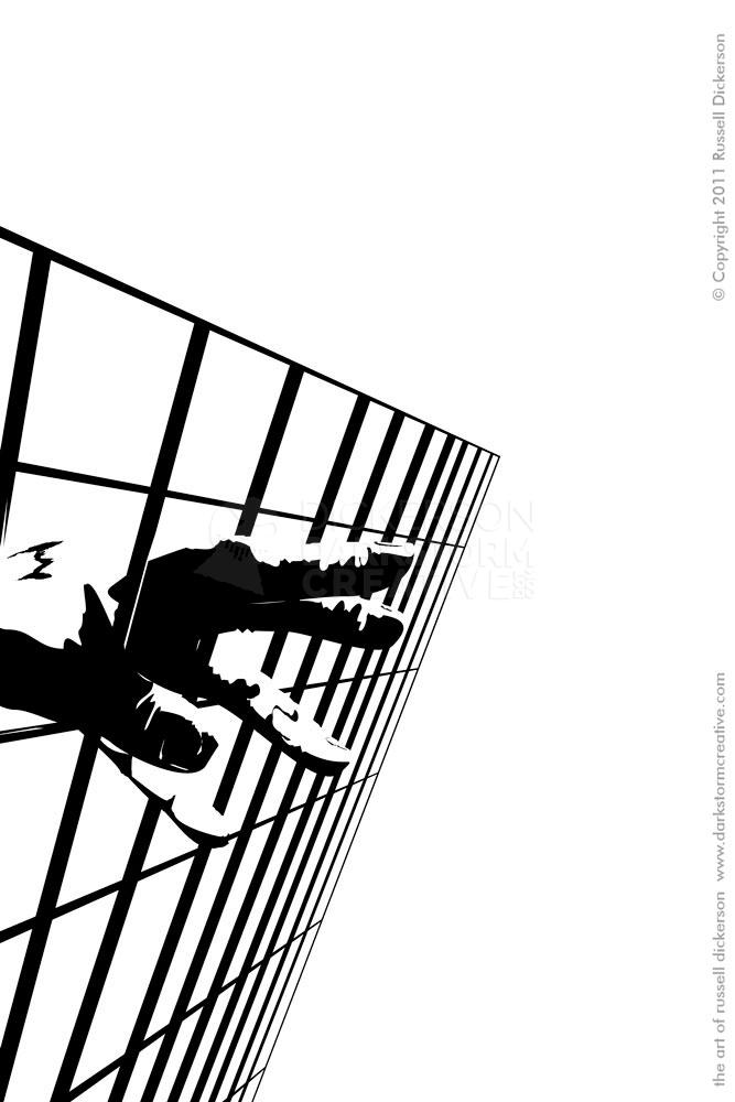
Crossroads come to all
Crossroads come to all
Artwork
This Week’s Art: Ivan the Terrible
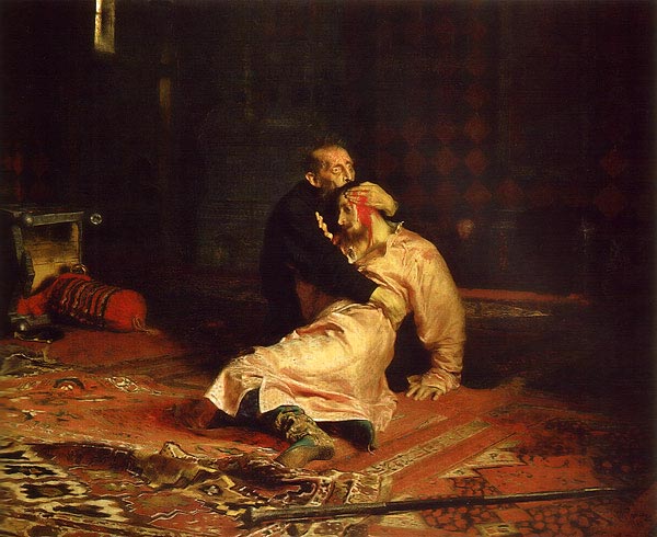
This Week’s Art: Ivan the Terrible
Russ's Art Blog, Russ's Art Talks