I wanted to do another ink today, and the first idea that hit me was actually Hellboy (it’s the 20 year anniversary of Hellboy today). But as I sat down to give an ink a try, a different idea hit me.
I’ve learned over time (painful, painful time) that I shouldn’t fight those needs. The brain wants something else, so I pay attention. In this case, my brain started talking about skulls, and reapers, even tentacles. So I sat down at the old art table (the same one I posted here, and no, it’s not any cleaner) and started working.
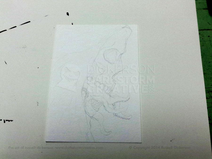
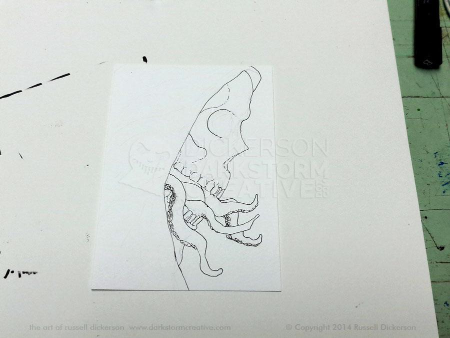
The first step was to sketch out my idea. Sometimes, that’s pretty loose, just a few lines here and there. Other times, like this one, I put a bit more into it. That’s mostly because, while the idea was strong, it wasn’t fully there just yet. A bit more detail in the pencil sketching stage often convinces me if the idea is right. In this case, I thought it was. Click on it, and any of the images, for larger versions.
I liked where it was heading, so I started inking it. The first step changes sometimes, but I like strong, solid backgrounds in my inkwork. The contrast always works for me with the art, it frames the detail well. In this case, I knew the black background would be on the right. So I started outlining on that side, knowing that was the edge of the detailed art.
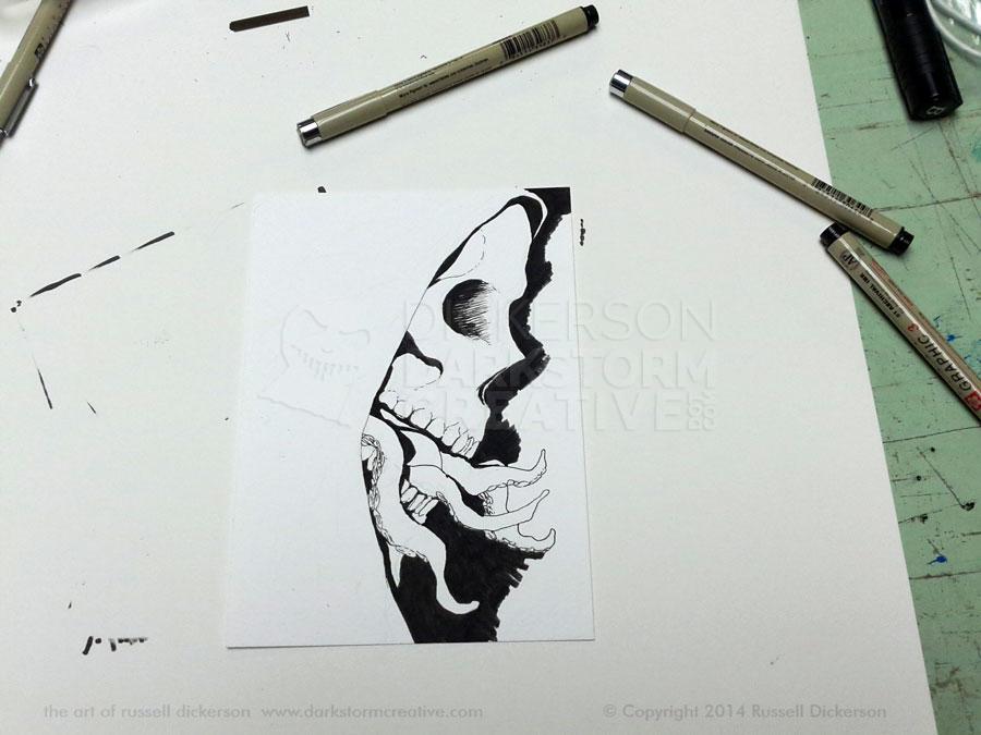
Now, for me, I now see the entire piece. In my head, all of its detail is there, fully imagined. That’s not to say I wouldn’t change my mind, and in fact I did later. But those lines define everything for me, as well as separating areas of solid dark.
One thing you may notice is that I don’t put a solid line on everything. Those solid lines only exist where I know a shadow will be. If I put a solid line everywhere at this point, I lose the texture of the crosshatching later on. The lines can become too constricting, so I only put a solid line where I know it’s the right place.
From this point, I often start crosshatching. This time, I decided to add part of the black areas to see how it would look. It changes the look of things, even before getting to the smaller lines that define the piece.
Since this step worked out fine, and I could really see well where it was going, I started adding the crosshatched lines.
I’ve considered making a short video while I’m crosshatching. But my style of crosshatching is what you would call, “batshit crazy”. I jump around constantly, from one spot to the other, just filling things in as they catch my eye. You would go insane trying to figure out any method in that madness.
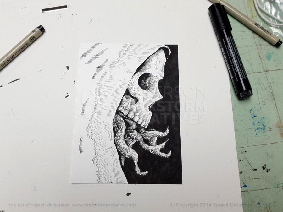
The crosshatching (I’ll finally tell you, that’s just a fancy word for “ten billion small lines that cross sometimes”) really brings in the idea of the piece. At each stage, it feels like a new piece, and especially at this one it really gets defined.
I actually considered leaving it alone here. I liked the white, it added a very bright contrast to the black on the right. But I kind of felt like it might come across as half-finished. Besides that, I really wanted to try to add more texture to it.
That meant lots and lots of tiny little lines. I could have just ink washed it, or used a lot of larger lines. But I really wanted a more intricate texture, one where the absence of lines defined the texture just as much as the lines themselves.
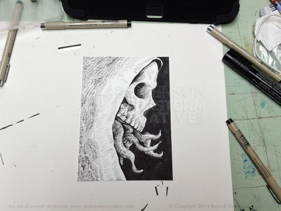
I really liked how it turned out, and in the overall piece it created an “on and off” feeling to the texture versus a solid area. I then took a brush, and inked the larger black areas so that they’d be a bit darker.
After that final step, it was scanned in to show off to you fine people. Here’s the final ink art, called Gravity’s End. It’s 5″ x 7″, Micron pens and black calligraphy ink on 140 lb. Cold Press stock. Let me know what you think.

Gravity’s End