Previously on my site here (well, here), I talked about foil stamp designs. I posted examples of designs from one of the books by Brian Keene, A Gathering of Crows. Earlier this summer I had the opportunity to create the foil stamp designs for the second Maelstrom set of books from Thunderstorm Books as well.
Foil stamp design is a bit different than the usual color work, as I explained in that previous article. Briefly, you don’t have many colors (or even shades of gray) to toy with, you get just one color. Like the first set, that color was black (to be pressed into white canvas cover boards).
The trick with these designs, aside from working in one color and vectors, is that you have to come up with an image that can be done in just that one color. In such rich, detailed environments as Brian Keene and John Urbancik write about, that’s not necessarily easy.
But the advantage here is that the foil design doesn’t have to recreate a world, like the cover (or interior art) does. The foil design just has to give a one-shot idea from the story, something that is iconic (if possible). It becomes a snapshot of one idea, something simple, yet ideal to give an idea from the story.
In fact, unlike a painted cover, if you try to add too much detail into the design it will turn out like mud. Tiny lines often don’t print, and small spaces between lines of color often fill right in. In my case, I expect that in certain areas, so it’s ok when they do. But you have to be very cognizant of where those locations are, and if it would really work that way.
The other thing to consider is the material that your cover will be created with. Sure, sometimes you do get a glossy, flat cover, and with the smoothness you get more detail. Most hard covers have a canvas texture to them, so the ink that you’re trying to stamp with is going to be affected by both the ridges and the valleys of the canvas.
Case in point, here’s a macro/closeup of one of the published books:

You can see that even in the heavy line, with a great, straight edge, the ink settles into the canvas in spots. If the line had been very thin, like a hairline, it might print broken in spots or even crooked.
If you have a good idea how things will fill in, you can have certain things fill in acceptably. If you look at the foil design for Once Upon a Time in Midnight (below), you can see that there are wrecked cars at the bottom of the pylon. Some of that filled in on the final print, being tiny, but other areas didn’t. Since that area has a bit of randomness to it anyway, any fill in or loss is acceptable. If the bars coming out of the concrete filled in though, then it wouldn’t have the right effect, so those are more broadly defined.
Here is the final foil stamp design for Once Upon a Time in Midnight, written by John Urbancik:

Once Upon a Time in Midnight
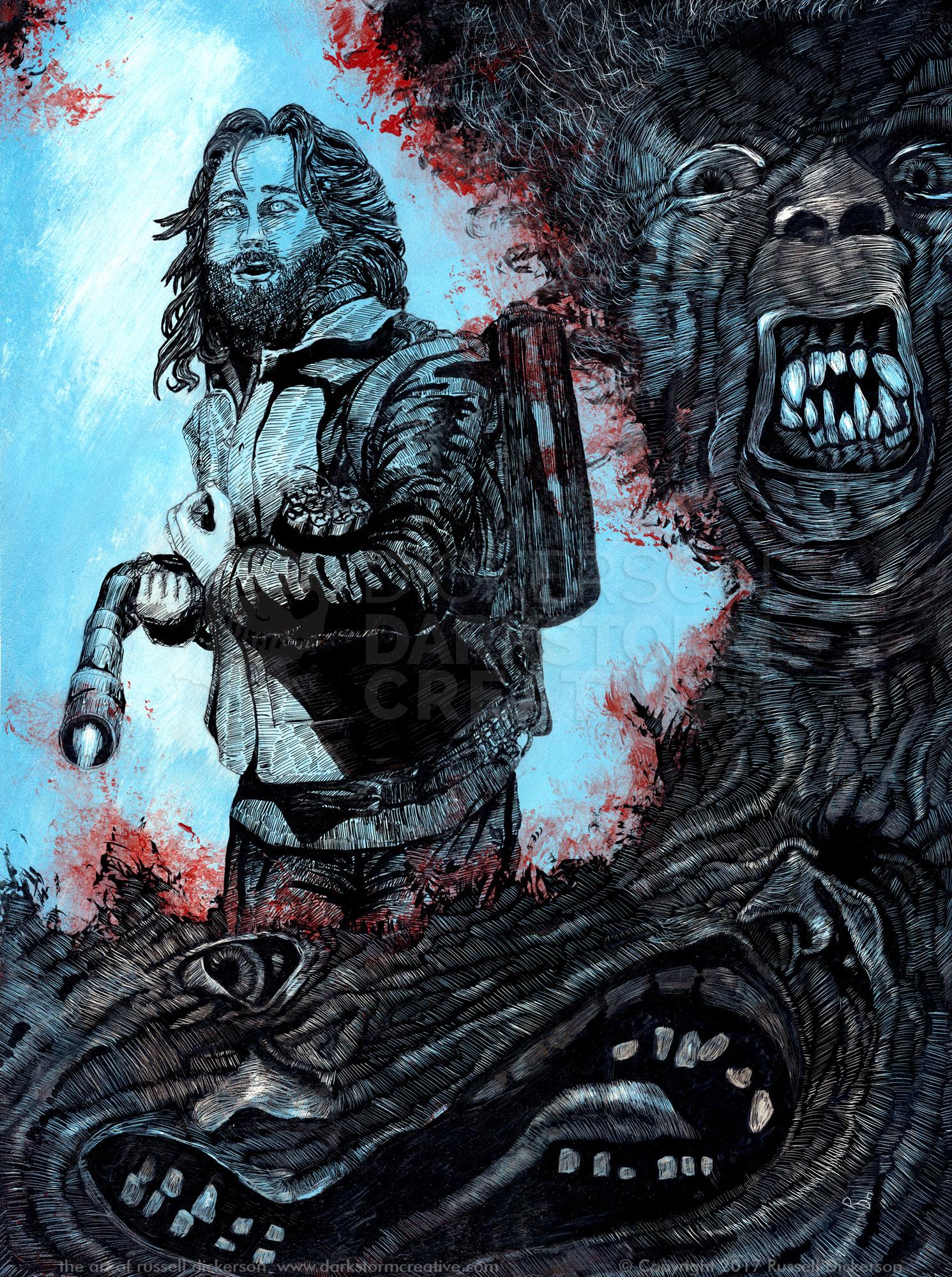
With Brian Keene’s A Conspiracy of One, I had a pretty clear idea of what would work well. The first story of the collection, The Cage, works perfectly for the foil.

The Cage, From A Conspiracy of One
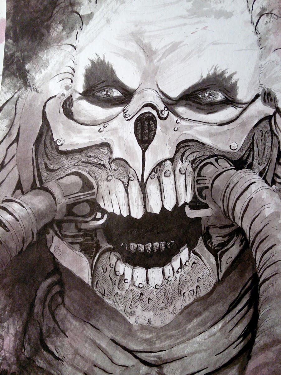
Keene’s other book in the set, Alone, presented a little more of a challenge. Working with Paul at Thunderstorm Books, and with Brian, we looked at one particular passage from the story that dealt with a nightmare that a character is having.
The nightmare, and the image that it encompasses, would be a great illustration full of color, or grays, but at the very least lots of soft tones. However, we don’t have that here, we just have that one color. So instead of using various thin lines and tricks to get similar effects, and possibly having everything fill in badly, we chose something different.
In the final version, we reverted back to almost an ink-style, a blocky look that gets the point of the massive dark figure looming towards the viewer, with the styled hints of movement in the air around him. It’s a certainly different look than the other two, but in keeping the blocky, high contrast art style they still work well together.

Alone
Overall, I hope to have captured at least some sense of the stories, and added a nice extra feature for the buyers of the set. I think as far as books go, the nice little added features are great, and I’m happy to get the opportunity to add to such neat collections.
Here are all three books together: