Dramatic Sense
Russ’s Art Blog: Achenbach – “Caught In A Squall”
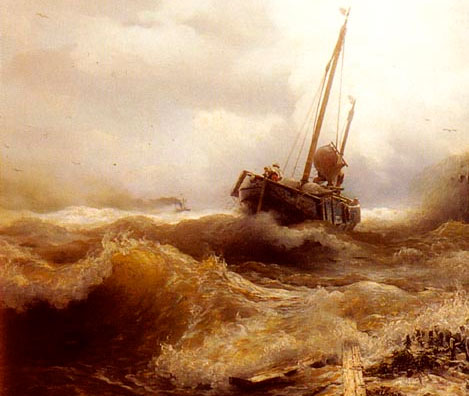
Russ’s Art Blog: Achenbach – “Caught In A Squall”
Russ's Art Blog, Russ's Art Talks
Russ’s Art Blog: And the sea gave up the dead
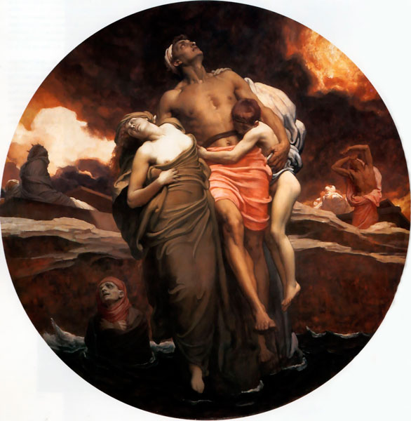
Russ’s Art Blog: And the sea gave up the dead
Russ's Art Blog, Russ's Art Talks
Russ’s Art Blog: Edd Cartier, Unknown Fantasy Fiction
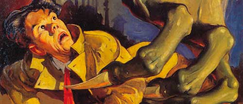
Russ’s Art Blog: Edd Cartier, Unknown Fantasy Fiction
Design, Russ's Art Blog, Russ's Art Talks