Darkness
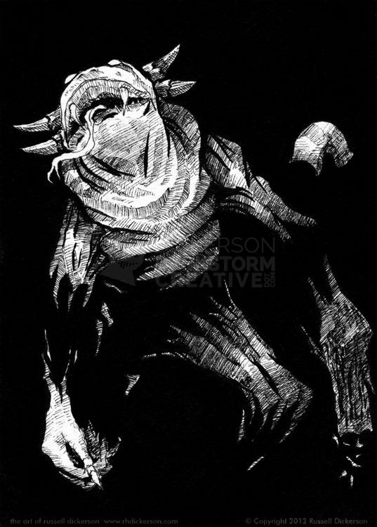
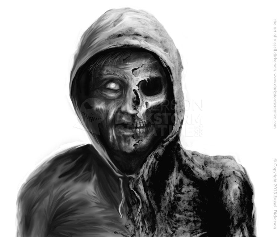
The night is darkest just before the dawn. And I promise you, the dawn is coming.
The night is darkest just before the dawn. And I promise you, the dawn is coming.
Artwork
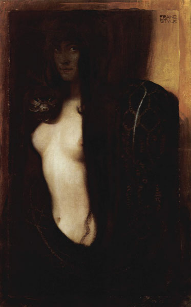
Russ’s Art Blog: Resistance, or The Black Idol
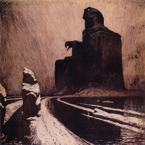
Russ’s Art Blog: Resistance, or The Black Idol
Russ's Art Blog, Russ's Art Talks
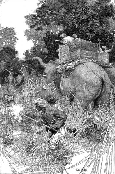
Russ’s Art Blog: Edd Cartier, Unknown Fantasy Fiction
Russ’s Art Blog: Edd Cartier, Unknown Fantasy Fiction
Design, Russ's Art Blog, Russ's Art Talks
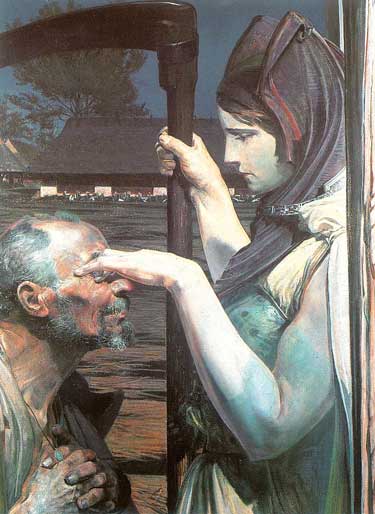
Crossroads come to all
Crossroads come to all
Artwork
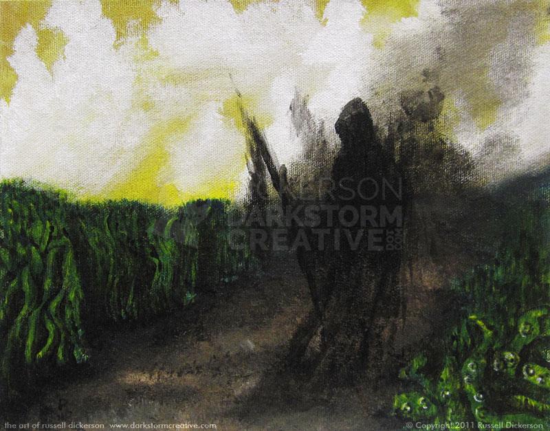
The Crossroads
The Crossroads
Artwork
Russ’s Art Blog: Artist Michael Deas
Russ’s Art Blog: Artist Michael Deas
Russ's Art Blog, Russ's Art Talks
This Week’s Art: Ivan the Terrible
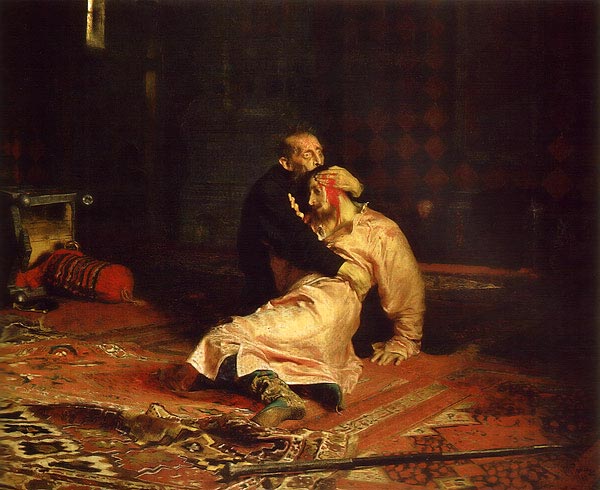
This Week’s Art: Ivan the Terrible
Russ's Art Blog, Russ's Art Talks
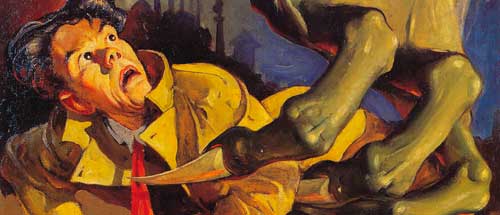
This Week’s Art: The Premature Burial
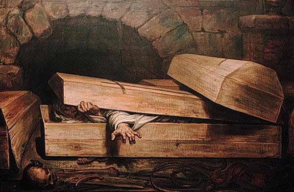
This Week’s Art: The Premature Burial
Russ's Art Blog, Russ's Art Talks
This Week’s Art: Remington’s Moonlight, Wolf
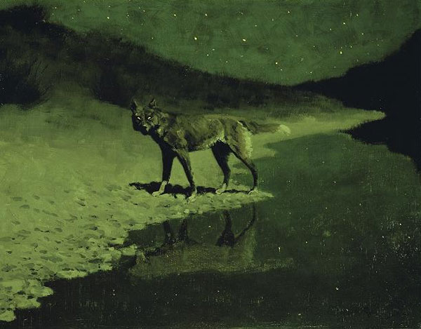
This Week’s Art: Remington’s Moonlight, Wolf
Russ's Art Blog, Russ's Art Talks