Composition
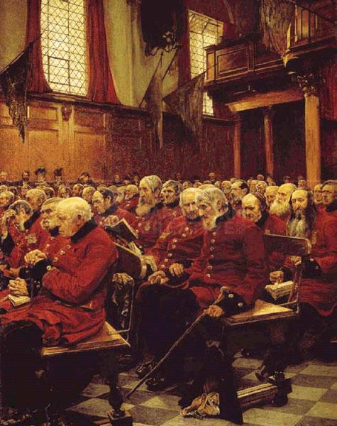
Russ’ Art Blog: The Plague of Rome
Russ’ Art Blog: The Plague of Rome
Russ's Art Blog, Russ's Art Talks
Russ’s Art Blog: “Pushkin’s Farewell to the Sea”
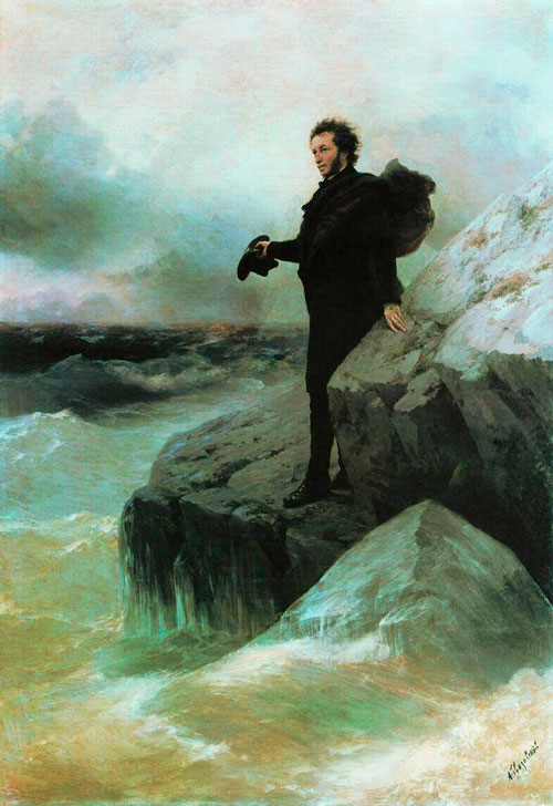
Russ’s Art Blog: “Pushkin’s Farewell to the Sea”
Russ's Art Blog, Russ's Art Talks
Russ’s Art Blog: N.C. Wyeth, Gunfight
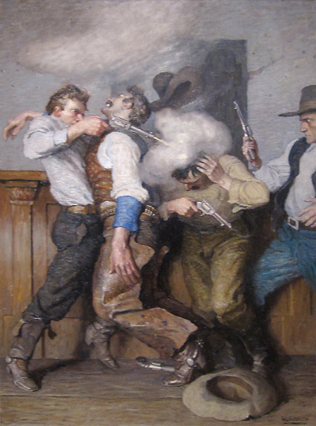
Russ’s Art Blog: N.C. Wyeth, Gunfight
Russ's Art Blog, Russ's Art Talks
Russ’ art blog: Ivan Shishkin’s Rain in the Oak Grove
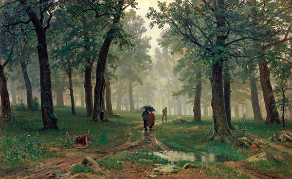
Russ’ art blog: Ivan Shishkin’s Rain in the Oak Grove
Russ's Art Blog, Russ's Art Talks
Russ’s Art Blog: Seeing it in real life – Pollice Verso
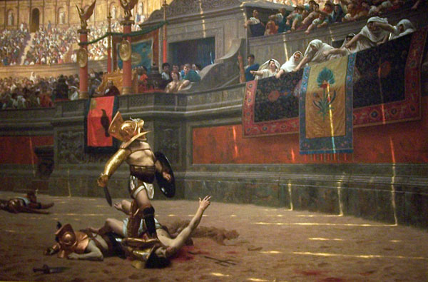
Russ’s Art Blog: Seeing it in real life – Pollice Verso
Russ's Art Blog, Russ's Art Talks
The New Art Blog: Assault on Belleau Wood
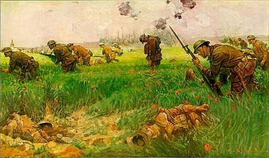
The New Art Blog: Assault on Belleau Wood
Russ's Art Blog, Russ's Art Talks
This Week’s Art: Ivan the Terrible
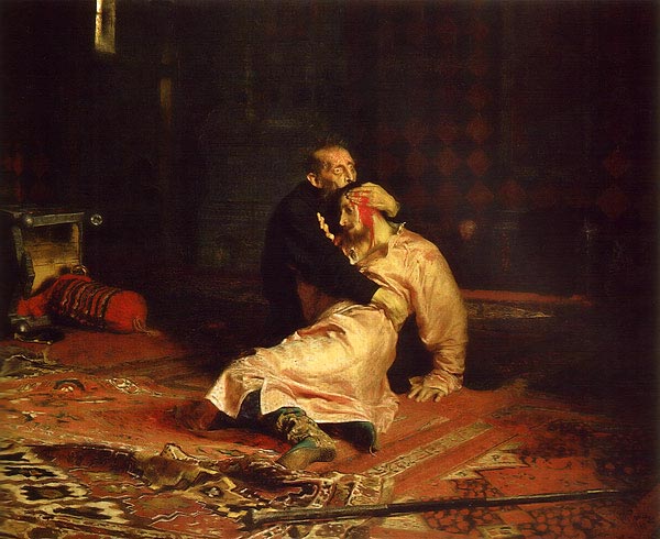
This Week’s Art: Ivan the Terrible
Russ's Art Blog, Russ's Art Talks
This Week’s Art: The Premature Burial
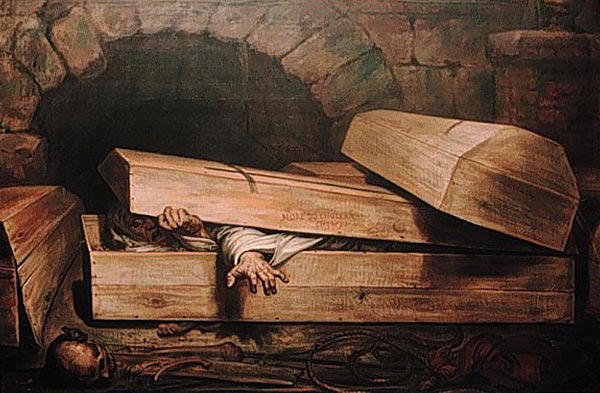
This Week’s Art: The Premature Burial
Russ's Art Blog, Russ's Art Talks
This Week’s Art: The Duel After the Masquerade
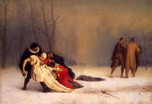
This Week’s Art: The Duel After the Masquerade
Russ's Art Blog, Russ's Art Talks
This Week’s Art: The Dead Stretcher Bearer
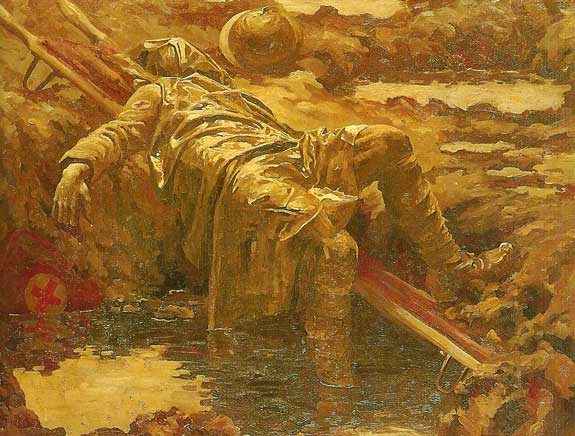
This Week’s Art: The Dead Stretcher Bearer
Russ's Art Blog, Russ's Art Talks
This Week’s Art: Skeletons Warming Themselves
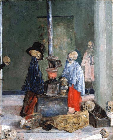
This Week’s Art: Skeletons Warming Themselves
Russ's Art Blog, Russ's Art Talks