Color Palette
Russ’ Art Blog: The Dream of Ossian
Russ’ Art Blog: The Dream of Ossian
Russ's Art Blog, Russ's Art Talks
Russ’ Art Blog: Death on a Pale Horse
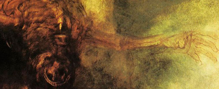
Russ’ Art Blog: Death on a Pale Horse
Russ's Art Blog, Russ's Art Talks
Russ’s Art Blog: Achenbach – “Caught In A Squall”
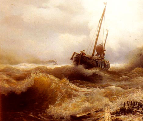
Russ’s Art Blog: Achenbach – “Caught In A Squall”
Russ's Art Blog, Russ's Art Talks
Russ’s Art Blog: N.C. Wyeth, Gunfight
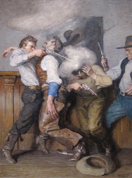
Russ’s Art Blog: N.C. Wyeth, Gunfight
Russ's Art Blog, Russ's Art Talks
Russ’ art blog: Ivan Shishkin’s Rain in the Oak Grove
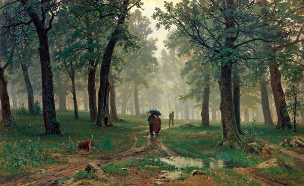
Russ’ art blog: Ivan Shishkin’s Rain in the Oak Grove
Russ's Art Blog, Russ's Art Talks