Artwork
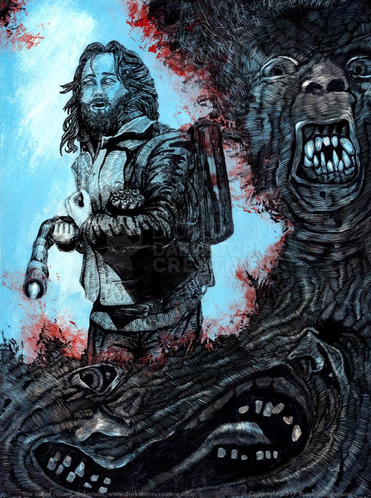
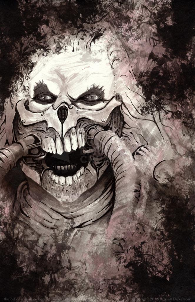

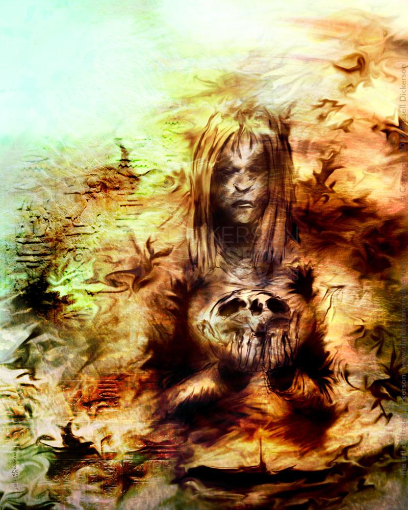
Hold on to your hats! A new art piece (finally)

Hold on to your hats! A new art piece (finally)
Artwork
The game is afoot: Ebook cover art and design
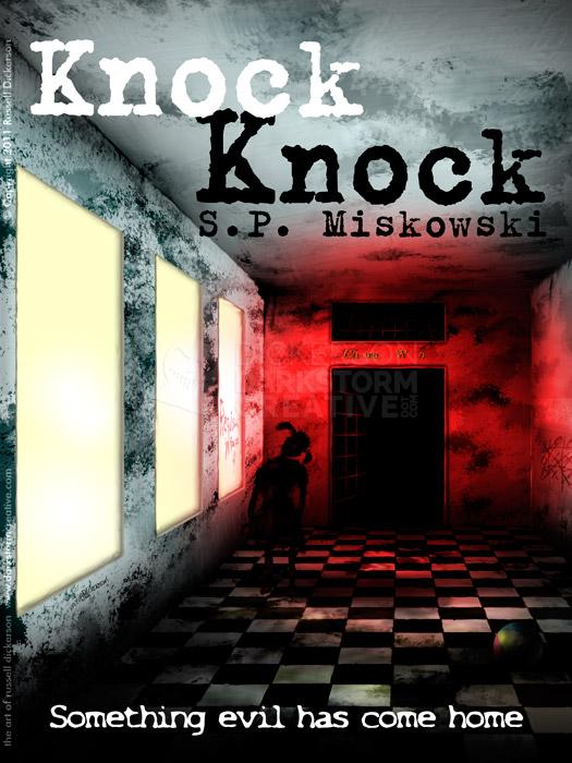
The game is afoot: Ebook cover art and design
Design, Russ's Art Blog
Egads! I’ve been framed!
Egads! I’ve been framed!
Artwork
New sketchcard: Phantoms and Lon Chaney, Sr.
New sketchcard: Phantoms and Lon Chaney, Sr.
Artwork
New Sketchcard: Phibes
New Sketchcard: Phibes
Artwork
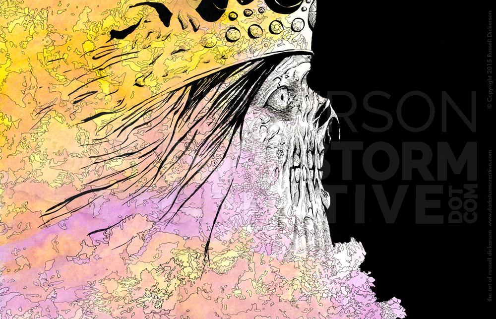
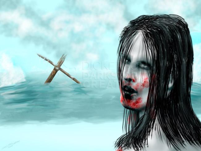
Maelstrom Cover #2: Of Crows and Obsessions
Maelstrom Cover #2: Of Crows and Obsessions
Artwork
Maelstrom Cover #1: Kelli Owen’s Six Days
Maelstrom Cover #1: Kelli Owen’s Six Days
Artwork
Marketing the authors
Marketing the authors
Artwork, Design, Russ's Art Blog
Of Caves and Alien Worlds
Of Caves and Alien Worlds
Russ's Art Blog
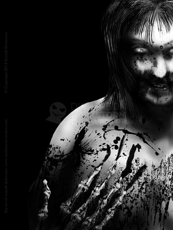
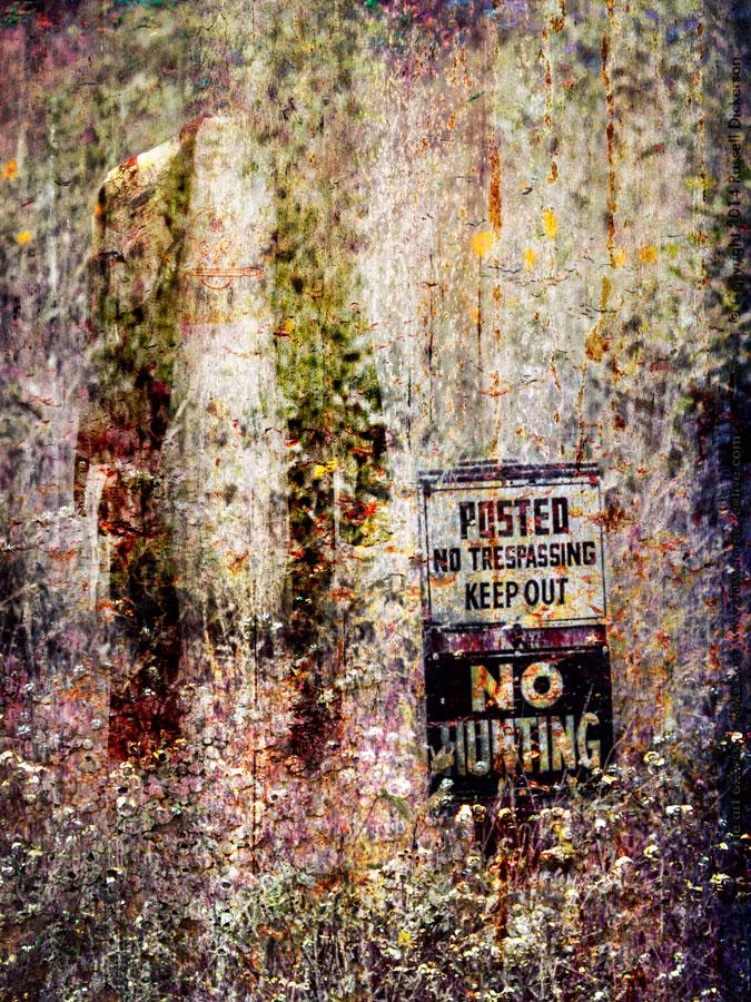
Infecting the frame around the art
Infecting the frame around the art
Artwork, Russ's Art Blog
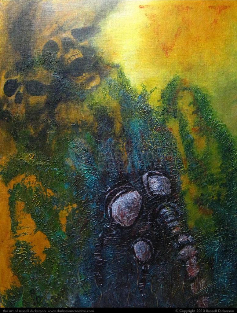
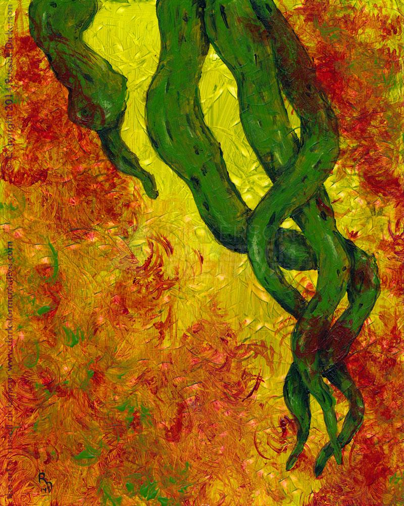
New Art: My first acrylic – no giggling
New Art: My first acrylic – no giggling
Artwork, Russ's Art Blog
Seeing it in real life: Church’s The Icebergs
Seeing it in real life: Church’s The Icebergs
General, Russ's Art Blog, Russ's Art Talks
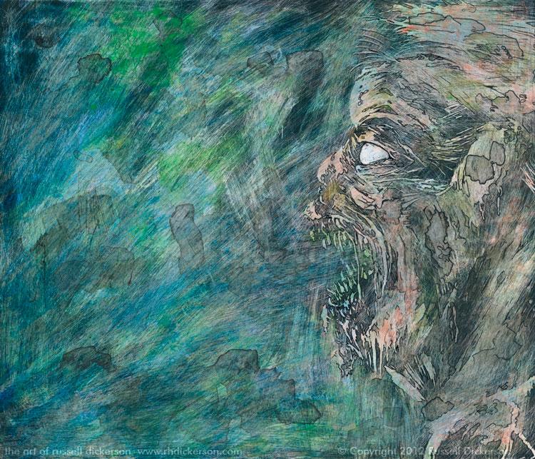
Sketching every day
Sketching every day
Artwork
VisionCon and the things I’m bringing
VisionCon and the things I’m bringing
Artwork, Design
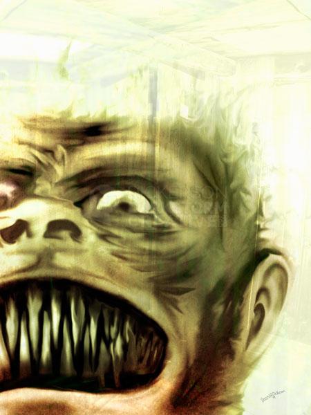
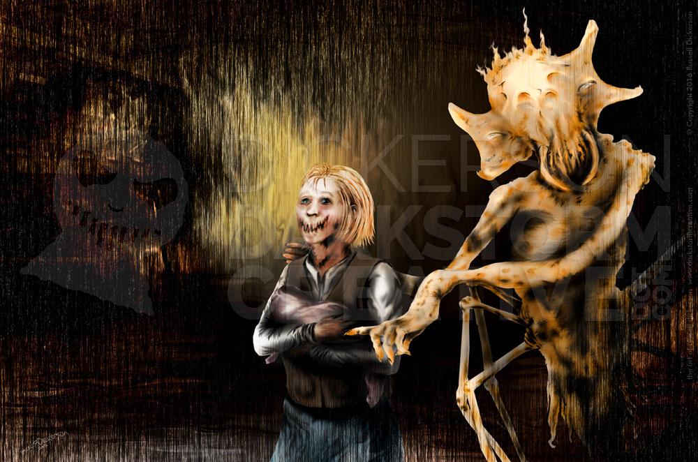
New artwork: night of the innocents
New artwork: night of the innocents
Artwork
Hey imagine that: New art by me!
Hey imagine that: New art by me!
Artwork
Music and the artist Part 1: Soundtracks
Music and the artist Part 1: Soundtracks
Russ's Art Blog
A new art promo for my art for Brian Keene’s Scratch
A new art promo for my art for Brian Keene’s Scratch
Artwork
A YouTube promo for my art
A YouTube promo for my art
Artwork, Design
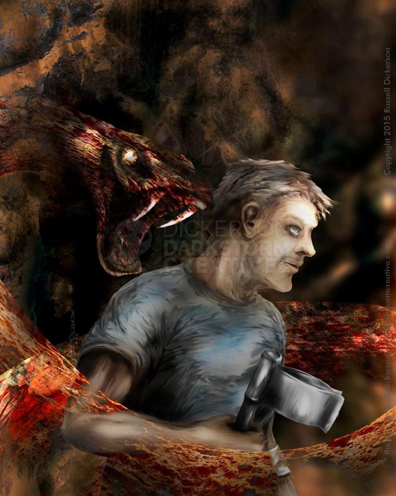
New Piece: Asylum Days
New Piece: Asylum Days
Artwork
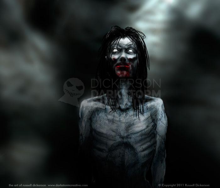
New wallpapers for Scratch
New wallpapers for Scratch
General