Art Pieces
New Cover Art: “Queen of the Dead” and the grand feedback experiment
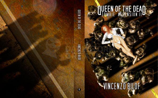
New Cover Art: “Queen of the Dead” and the grand feedback experiment
Artwork
Using the iPad as a portfolio
Using the iPad as a portfolio
Design, Russ's Art Blog
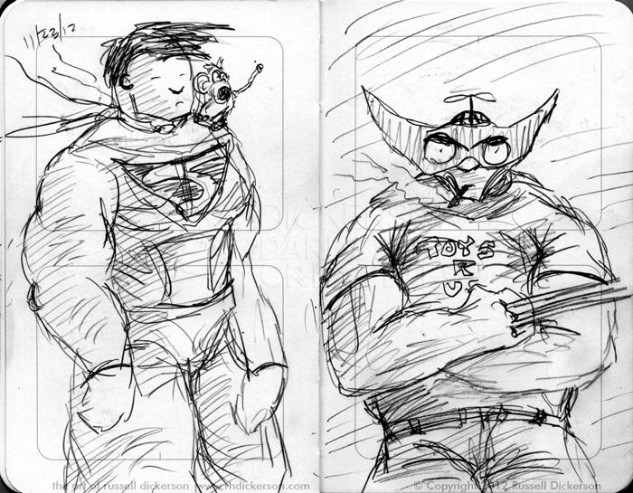
From Scratch to Tarkin: Creating the new art
From Scratch to Tarkin: Creating the new art
Artwork
My art on the walls of the local Jerry’s Artarama
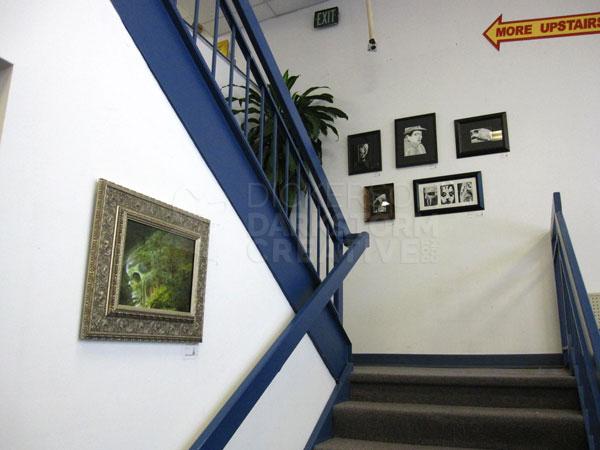
My art on the walls of the local Jerry’s Artarama
Russ's Art Blog
A gathering of art blogs: the current index
A gathering of art blogs: the current index
Russ's Art Blog, Russ's Art Talks
Russ’s Art Blog: And the sea gave up the dead
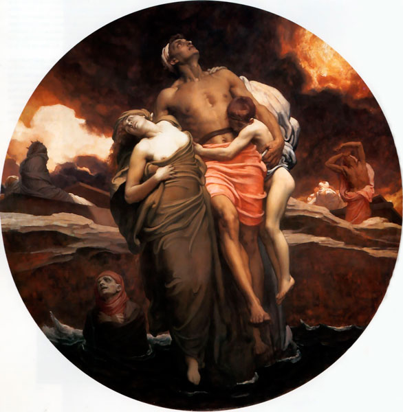
Russ’s Art Blog: And the sea gave up the dead
Russ's Art Blog, Russ's Art Talks
New wallpapers of my work
New wallpapers of my work
Artwork, General
This Week’s Art: Ivan the Terrible
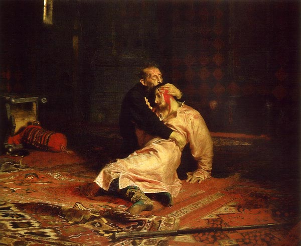
This Week’s Art: Ivan the Terrible
Russ's Art Blog, Russ's Art Talks