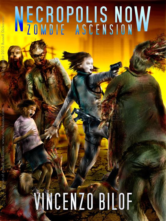
Art Book
Russ’s Art Blog: Bierstadt, and seeing it in person
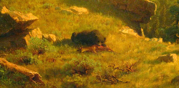
Russ’s Art Blog: Bierstadt, and seeing it in person
Russ's Art Blog, Russ's Art Talks
Russ’s Art Blog: Edd Cartier, Unknown Fantasy Fiction
Russ’s Art Blog: Edd Cartier, Unknown Fantasy Fiction
Design, Russ's Art Blog, Russ's Art Talks
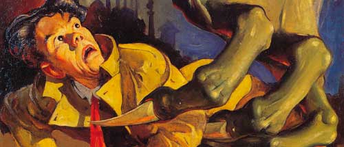
This Week’s Art: Pulp Artist H.J. Ward
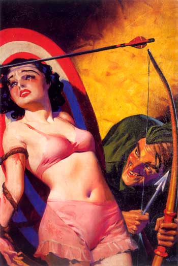
This Week’s Art: Pulp Artist H.J. Ward
Russ's Art Blog, Russ's Art Talks