Art


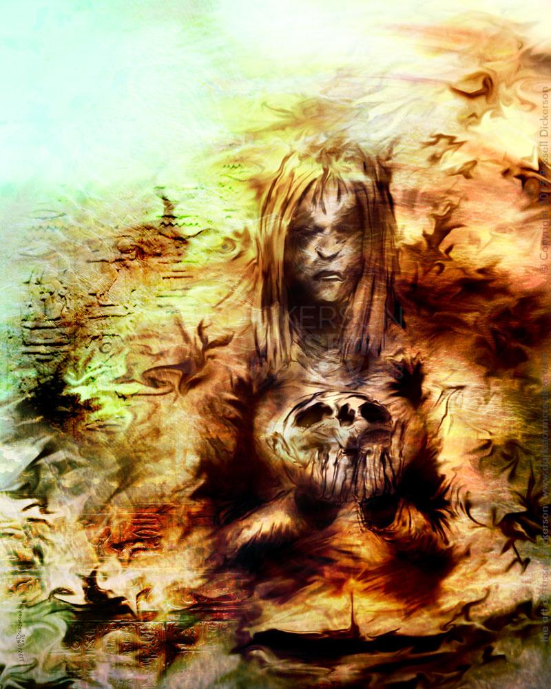
My cover art for S.P. Miskowski’s “In The Light”
My cover art for S.P. Miskowski’s “In The Light”
Artwork, Design, Russ's Art Blog
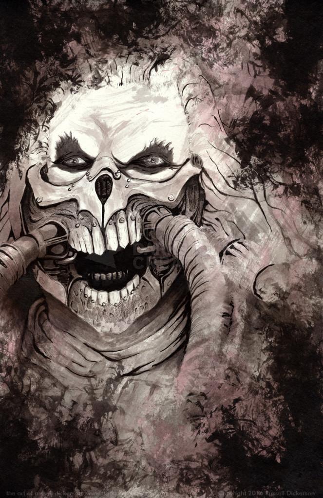
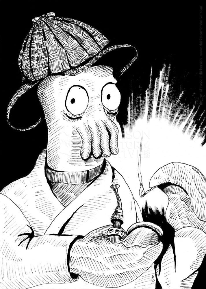
New ink art and Alphabeast: J is for Jikininki
New ink art and Alphabeast: J is for Jikininki
Alphabeasts, Artwork
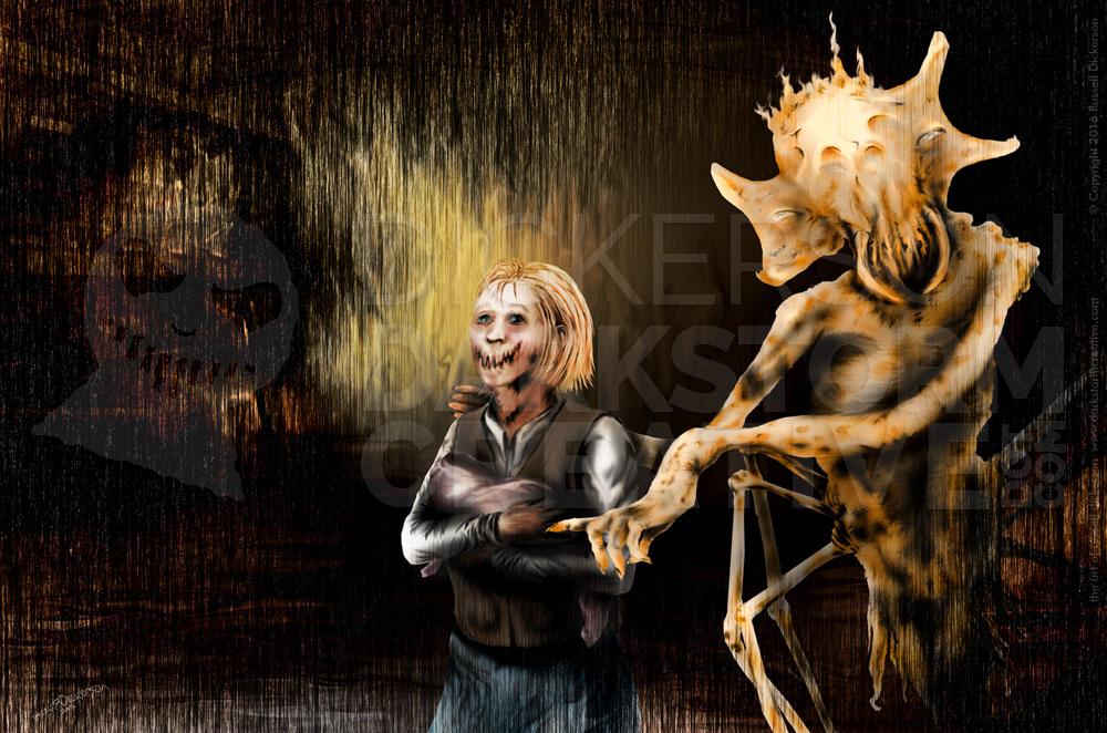
New cover art & design: Fleshbags
New cover art & design: Fleshbags
Artwork, Design
The Golden Ratio or Fibonacci Spiral
The Golden Ratio or Fibonacci Spiral
Artwork, Russ's Art Blog
Back to the beginning
Back to the beginning
Artwork
Galleries I’m in Part 1: The Gallery Underground
Galleries I’m in Part 1: The Gallery Underground
General
From start to finish: The Cover of Brian Keene’s Scratch
From start to finish: The Cover of Brian Keene’s Scratch
Artwork, Russ's Art Blog
Approaching art from all angles
Approaching art from all angles
Artwork, Russ's Art Blog
My current Apex Magazine blogs
My current Apex Magazine blogs
Russ's Art Blog
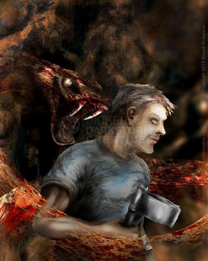
My art for Brian Keene’s novella Scratch
My art for Brian Keene’s novella Scratch
Artwork, Russ's Art Blog
Now at the gallery
Now at the gallery
Artwork
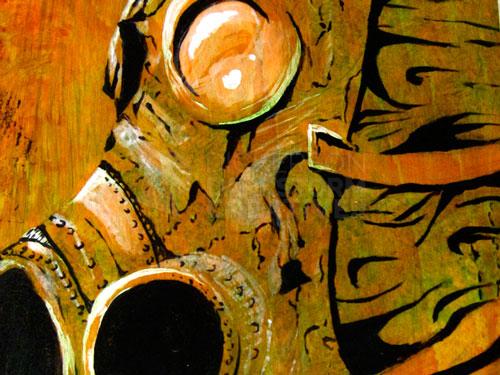
New Art: My first acrylic – no giggling
New Art: My first acrylic – no giggling
Artwork, Russ's Art Blog
Technology can actually be fun sometimes
Technology can actually be fun sometimes
Artwork, Russ's Art Blog
Behold! The mighty Moleskine!
Behold! The mighty Moleskine!
General
Seeing it in real life: Church’s The Icebergs
Seeing it in real life: Church’s The Icebergs
General, Russ's Art Blog, Russ's Art Talks
New art! Finally!
New art! Finally!
Artwork
Updates and a new gallery
Updates and a new gallery
General
A gathering of art blogs: the current index
A gathering of art blogs: the current index
Russ's Art Blog, Russ's Art Talks
The life of the artist
The life of the artist
Artwork, General
My thoughts on the coming year
My thoughts on the coming year
General
My first con art show and “guesthood”
My first con art show and “guesthood”
General
Hey imagine that: New art by me!
Hey imagine that: New art by me!
Artwork
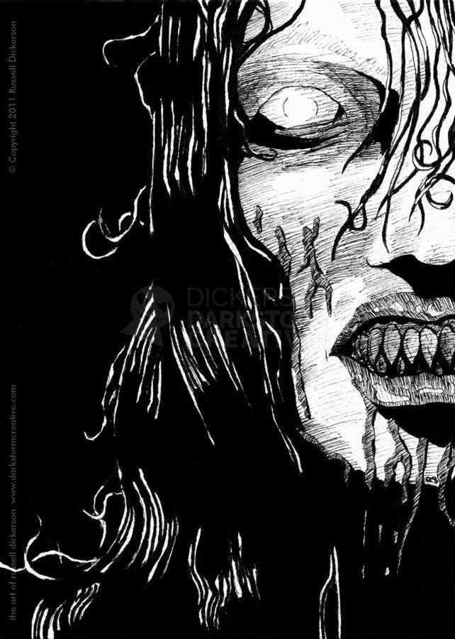
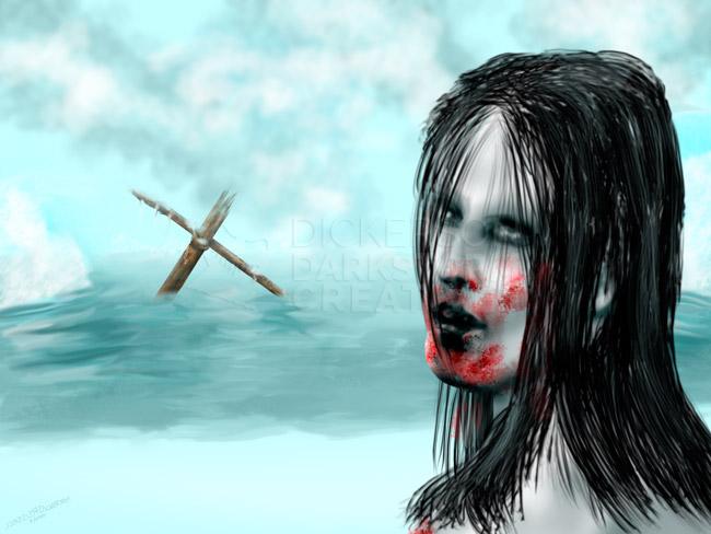
New Artwork: Deathly Reflection
New Artwork: Deathly Reflection
Artwork
Making prints of my art
Making prints of my art
Artwork
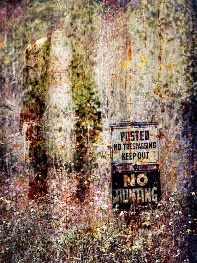
Crossroads come to all
Crossroads come to all
Artwork
Fun with Photoshop: The Big Adios
Fun with Photoshop: The Big Adios
Artwork