Halloween: Colonel America
Halloween: Colonel America
Artwork, General
New Artwork: Deathly Reflection
New Artwork: Deathly Reflection
Artwork
More Fun With Photoshop: Scratches
More Fun With Photoshop: Scratches
Russ's Art Blog
Russ’s Art Blog: A Wolf Had Not Been Seen in Salem for Thirty Years
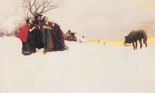
Russ’s Art Blog: A Wolf Had Not Been Seen in Salem for Thirty Years
Russ's Art Blog, Russ's Art Talks
Zombie squash and learning from nature
Zombie squash and learning from nature
Artwork, Photography