Russ’s Art Blog: Vedder – The Questioner of the Sphinx
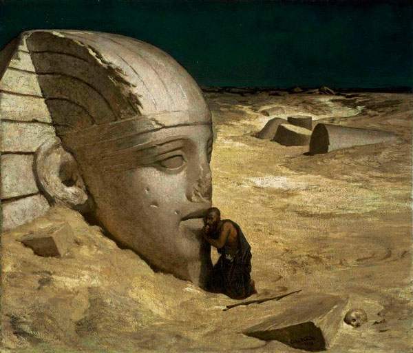
Russ’s Art Blog: Vedder – The Questioner of the Sphinx
Russ's Art Blog, Russ's Art Talks
Russ’s Art Blog: Bierstadt, and seeing it in person
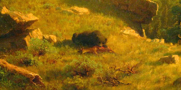
Russ’s Art Blog: Bierstadt, and seeing it in person
Russ's Art Blog, Russ's Art Talks
The old architecture ways
The old architecture ways
Artwork, Design