Color sketching and fun with Photoshop
Color sketching and fun with Photoshop
Artwork
Russ’s Art Blog: Resistance, or The Black Idol
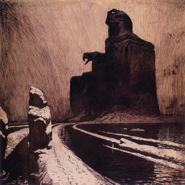
Russ’s Art Blog: Resistance, or The Black Idol
Russ's Art Blog, Russ's Art Talks
Russ’s Art Blog: And the sea gave up the dead
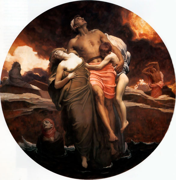
Russ’s Art Blog: And the sea gave up the dead
Russ's Art Blog, Russ's Art Talks
Russ’s Art Blog: N.C. Wyeth, Gunfight
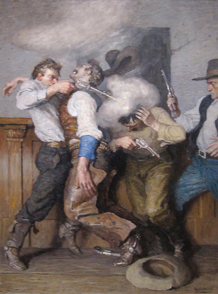
Russ’s Art Blog: N.C. Wyeth, Gunfight
Russ's Art Blog, Russ's Art Talks
Cheap lamp + skull = anatomy reference
Cheap lamp + skull = anatomy reference
Artwork, General, Russ's Art Blog
Sketchy McSketch-Sketch
Sketchy McSketch-Sketch
Artwork