Russ’s Art Blog: Frederic Edwin Church, The Icebergs
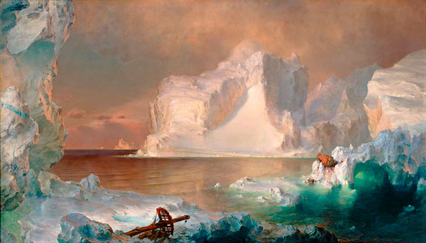
Russ’s Art Blog: Frederic Edwin Church, The Icebergs
Russ's Art Blog, Russ's Art Talks
New Wallpapers from my photos
New Wallpapers from my photos
General, Photography
Russ’s Art Blog: Edd Cartier, Unknown Fantasy Fiction
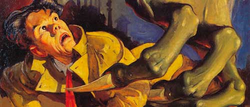
Russ’s Art Blog: Edd Cartier, Unknown Fantasy Fiction
Design, Russ's Art Blog, Russ's Art Talks
New wallpapers of my work
New wallpapers of my work
Artwork, General
Russ’ art blog: Ivan Shishkin’s Rain in the Oak Grove
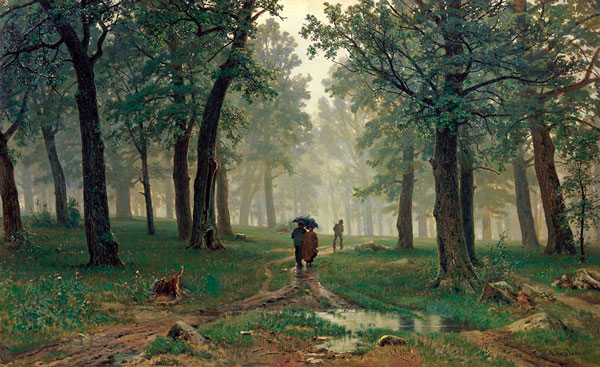
Russ’ art blog: Ivan Shishkin’s Rain in the Oak Grove
Russ's Art Blog, Russ's Art Talks
Reworked for Deviant Art
Reworked for Deviant Art
Artwork