This Week’s Art: The Premature Burial
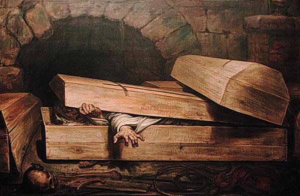
This Week’s Art: The Premature Burial
Russ's Art Blog, Russ's Art Talks
This Week’s Art: The Duel After the Masquerade
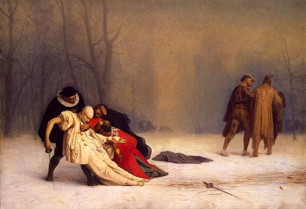
This Week’s Art: The Duel After the Masquerade
Russ's Art Blog, Russ's Art Talks
This Week’s Art: Rising of the Bones
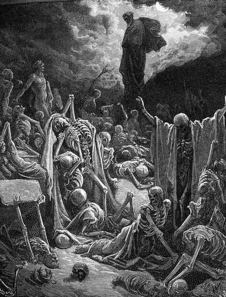
This Week’s Art: Rising of the Bones
Russ's Art Blog, Russ's Art Talks