This Week’s Art: The Dead Stretcher Bearer
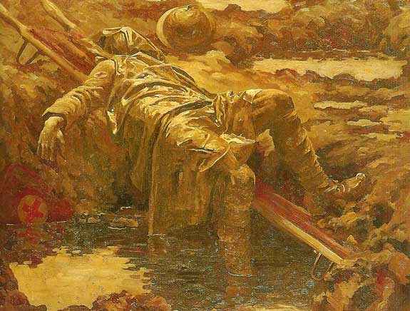
This Week’s Art: The Dead Stretcher Bearer
Russ's Art Blog, Russ's Art Talks
This Week’s Art: Wanderer Above a Sea of Mist

This Week’s Art: Wanderer Above a Sea of Mist
Russ's Art Blog, Russ's Art Talks
NeCon coming right up
NeCon coming right up
General
This Week’s Art: Expulsion – Moon and Firelight
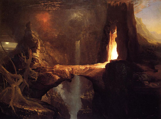
This Week’s Art: Expulsion – Moon and Firelight
Russ's Art Blog, Russ's Art Talks