Design

New Hardcover Foil Imprint Designs: Maelstrom Set 3
New Hardcover Foil Imprint Designs: Maelstrom Set 3
Artwork, Design
New imprint illustration and design: Douglas Western

New imprint illustration and design: Douglas Western
Artwork, Design
New Movie Poster Art: In The Mouth of Madness
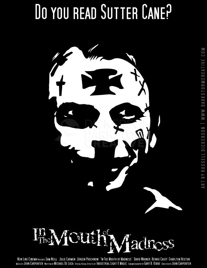
New Movie Poster Art: In The Mouth of Madness
Artwork, Design
Designing Foil Stamps for Covers: Maelstrom Set #2
Designing Foil Stamps for Covers: Maelstrom Set #2
Artwork, Design, Russ's Art Blog
New Movie Poster: Something Wicked This Way Comes
New Movie Poster: Something Wicked This Way Comes
Artwork, Design

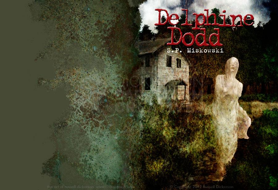
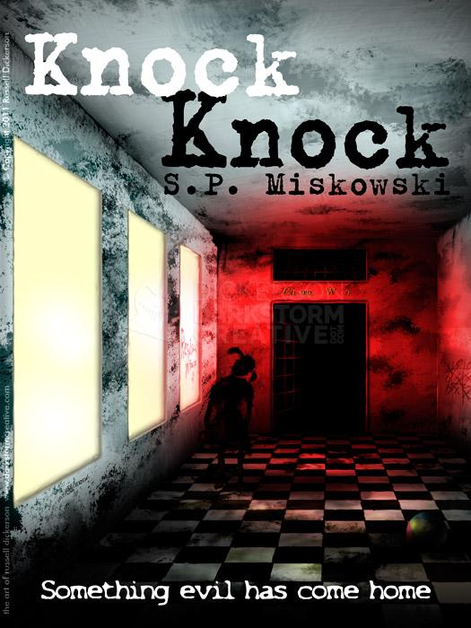
My cover art for S.P. Miskowski’s “In The Light”
My cover art for S.P. Miskowski’s “In The Light”
Artwork, Design, Russ's Art Blog
New cover art & design: Fleshbags
New cover art & design: Fleshbags
Artwork, Design
Fun with Typography
Fun with Typography
Design, Russ's Art Blog
The game is afoot: Ebook cover art and design
The game is afoot: Ebook cover art and design
Design, Russ's Art Blog
Using the iPad as a portfolio
Using the iPad as a portfolio
Design, Russ's Art Blog
Of Soccer and T-Shirts, and Steel
Of Soccer and T-Shirts, and Steel
Design
Marketing the authors
Marketing the authors
Artwork, Design, Russ's Art Blog
Dabbling in the land of multimedia
Dabbling in the land of multimedia
Design, Russ's Art Blog
VisionCon and the things I’m bringing
VisionCon and the things I’m bringing
Artwork, Design
A YouTube promo for my art
A YouTube promo for my art
Artwork, Design
The old architecture ways
The old architecture ways
Artwork, Design
Russ’s Art Blog: Edd Cartier, Unknown Fantasy Fiction
Russ’s Art Blog: Edd Cartier, Unknown Fantasy Fiction
Design, Russ's Art Blog, Russ's Art Talks
Graphic design: my red-headed step child
Graphic design: my red-headed step child
Design, General
Photoshop: fun with warping
Photoshop: fun with warping
Artwork, Design, Russ's Art Blog