Russ's Art Blog
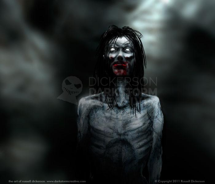
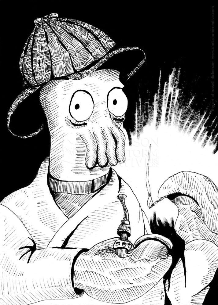
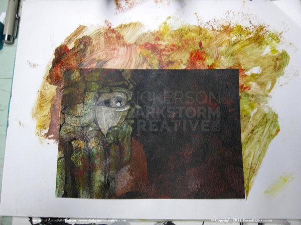
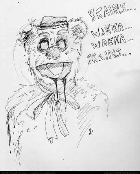
Creating the ink art: The Mouth of Sauron
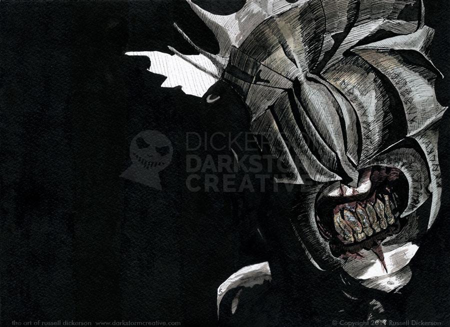
Creating the ink art: The Mouth of Sauron
Artwork, Russ's Art Blog
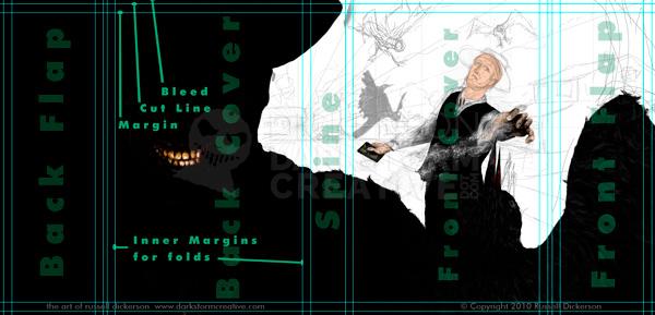
Designing Foil Stamps for Covers: Maelstrom Set #2
Designing Foil Stamps for Covers: Maelstrom Set #2
Artwork, Design, Russ's Art Blog
Creating a cover from scratch: Ray Garton’s Vortex
Creating a cover from scratch: Ray Garton’s Vortex
Artwork, Russ's Art Blog

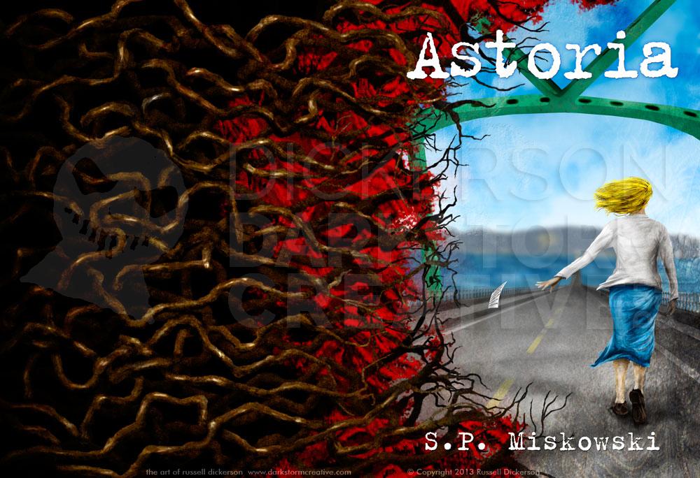
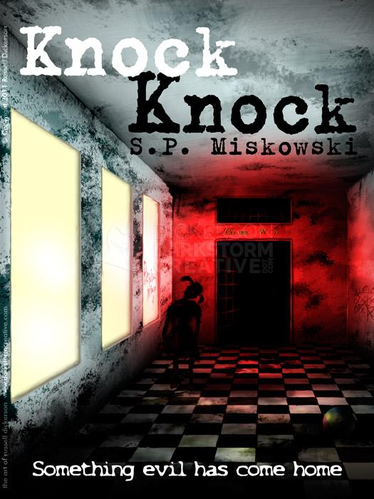
My cover art for S.P. Miskowski’s “In The Light”
My cover art for S.P. Miskowski’s “In The Light”
Artwork, Design, Russ's Art Blog
Spectrum Art Show Recap Part 2: As an attendee and artist
Spectrum Art Show Recap Part 2: As an attendee and artist
Russ's Art Blog
Spectrum Art Show Recap Part 1: As an Exhibitor
Spectrum Art Show Recap Part 1: As an Exhibitor
Russ's Art Blog
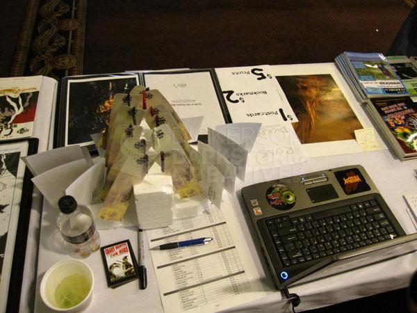
Travels of my first booth part 1: The mess of things
Travels of my first booth part 1: The mess of things
Artwork, Russ's Art Blog
The Tools and Materials I Use, Part 2: Painting and other uses
The Tools and Materials I Use, Part 2: Painting and other uses
Russ's Art Blog
The Tools and Materials I Use, Part 1: Stock, ink, pencils
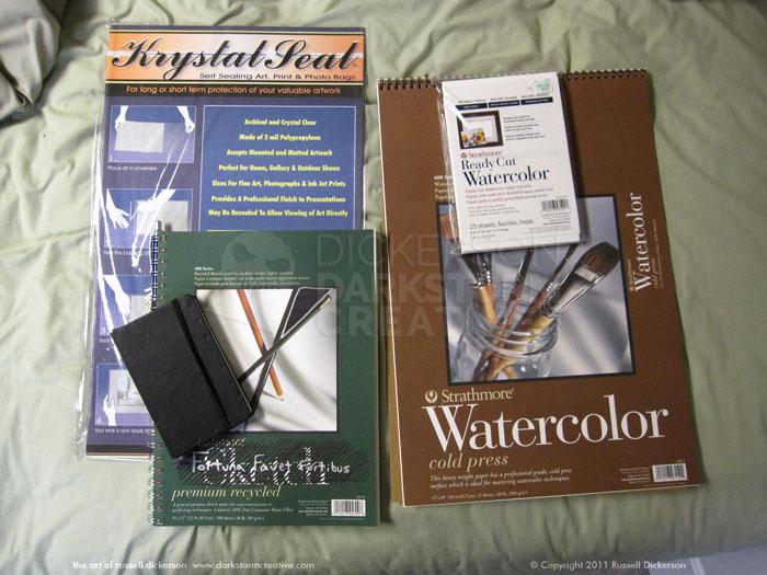
The Tools and Materials I Use, Part 1: Stock, ink, pencils
Russ's Art Blog
Fun with Typography
Fun with Typography
Design, Russ's Art Blog
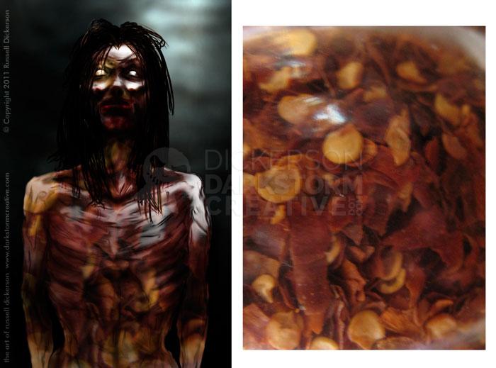
New Ink Art and working with reference: Cthulhucraft
New Ink Art and working with reference: Cthulhucraft
Artwork, Russ's Art Blog
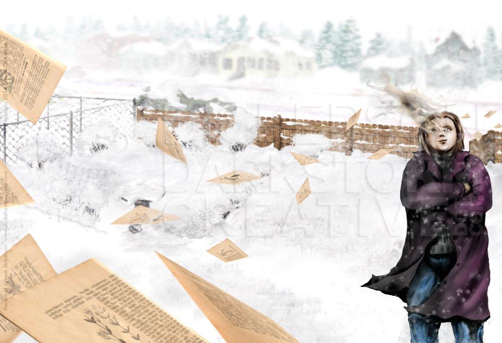
The game is afoot: Ebook cover art and design
The game is afoot: Ebook cover art and design
Design, Russ's Art Blog
To be [social] or not to be [social]
To be [social] or not to be [social]
Russ's Art Blog
Technology and Art: Google Earth
Technology and Art: Google Earth
Russ's Art Blog
Nature and the artist: Rocky Mountain National Park
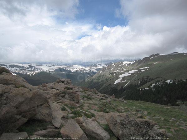
Nature and the artist: Rocky Mountain National Park
Russ's Art Blog
Hotlinking – not as nice as it sounds
Hotlinking – not as nice as it sounds
Russ's Art Blog
A fun new idea: artists posting at 10 am every day
A fun new idea: artists posting at 10 am every day
Russ's Art Blog
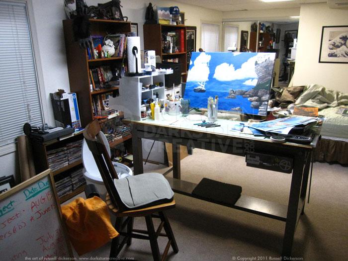
My art technique and artist bookshelves
My art technique and artist bookshelves
Russ's Art Blog
Using the iPad as a portfolio
Using the iPad as a portfolio
Design, Russ's Art Blog
Seeing it in a museum
Seeing it in a museum
Russ's Art Blog, Russ's Art Talks
My art on the walls of the local Jerry’s Artarama
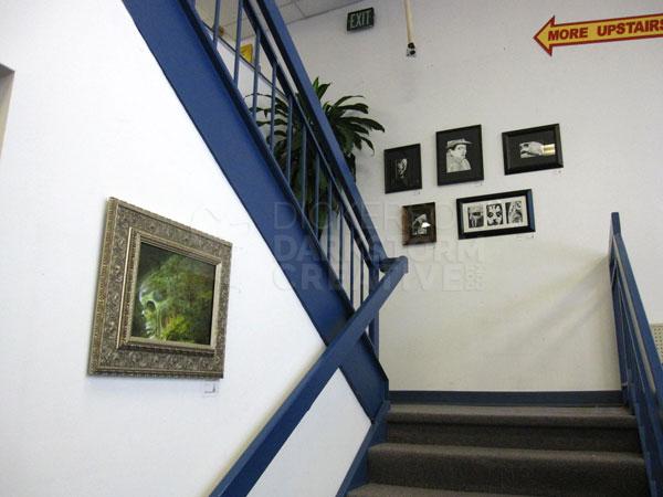
My art on the walls of the local Jerry’s Artarama
Russ's Art Blog
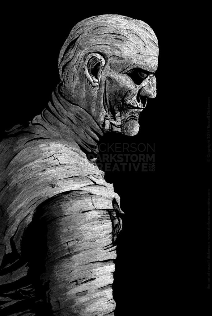
Stepping back: comparing the ink project
Stepping back: comparing the ink project
Artwork, Russ's Art Blog
Second star on the right, and straight on ’til morning
Second star on the right, and straight on ’til morning
Artwork, Russ's Art Blog
Graphic Design and Art: My cover for A Gathering of Crows
Graphic Design and Art: My cover for A Gathering of Crows
Russ's Art Blog
The Golden Ratio or Fibonacci Spiral
The Golden Ratio or Fibonacci Spiral
Artwork, Russ's Art Blog
Marketing the authors
Marketing the authors
Artwork, Design, Russ's Art Blog
Of Caves and Alien Worlds
Of Caves and Alien Worlds
Russ's Art Blog
Infecting the frame around the art
Infecting the frame around the art
Artwork, Russ's Art Blog
From start to finish: The Cover of Brian Keene’s Scratch
From start to finish: The Cover of Brian Keene’s Scratch
Artwork, Russ's Art Blog
Approaching art from all angles
Approaching art from all angles
Artwork, Russ's Art Blog
My current Apex Magazine blogs
My current Apex Magazine blogs
Russ's Art Blog
My art for Brian Keene’s novella Scratch
My art for Brian Keene’s novella Scratch
Artwork, Russ's Art Blog
New Art: My first acrylic – no giggling
New Art: My first acrylic – no giggling
Artwork, Russ's Art Blog
Technology can actually be fun sometimes
Technology can actually be fun sometimes
Artwork, Russ's Art Blog
Dabbling in the land of multimedia
Dabbling in the land of multimedia
Design, Russ's Art Blog
Seeing it in real life: Church’s The Icebergs
Seeing it in real life: Church’s The Icebergs
General, Russ's Art Blog, Russ's Art Talks
Feng shui it’s not
Feng shui it’s not
Artwork, Russ's Art Blog
A gathering of art blogs: the current index
A gathering of art blogs: the current index
Russ's Art Blog, Russ's Art Talks
Russ’ Art Blog: Daguerre’s “Ruined Gothic Colonnade”
Russ’ Art Blog: Daguerre’s “Ruined Gothic Colonnade”
Russ's Art Blog, Russ's Art Talks
Russ’ Art Blog: Mount Etna from Taormina
Russ’ Art Blog: Mount Etna from Taormina
Russ's Art Blog, Russ's Art Talks
Russ’ Art Blog: The Dream of Ossian
Russ’ Art Blog: The Dream of Ossian
Russ's Art Blog, Russ's Art Talks
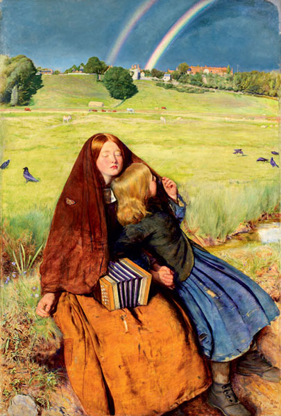
Russ’ Art Blog: The Young Lady with the Shiner
Russ’ Art Blog: The Young Lady with the Shiner
Russ's Art Blog, Russ's Art Talks
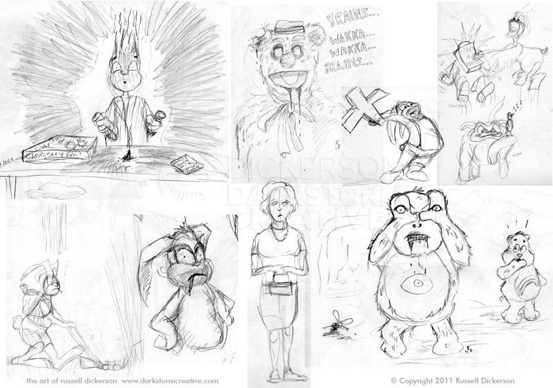
Sketchy McSketch Sketch: November and Moleskines
Sketchy McSketch Sketch: November and Moleskines
Artwork, Russ's Art Blog
Russ’ Art Blog: The Apotheosis of War
Russ’ Art Blog: The Apotheosis of War
Russ's Art Blog, Russ's Art Talks
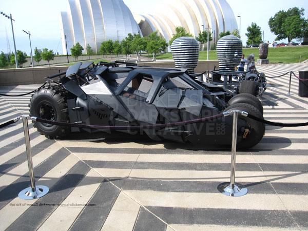
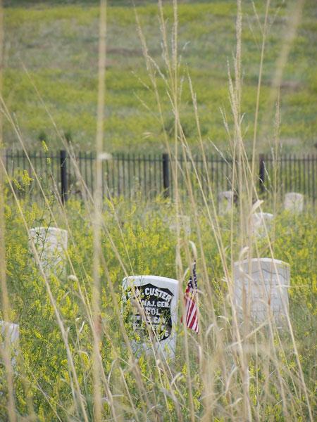
The big trip: Hartford and New York City
The big trip: Hartford and New York City
General, Russ's Art Blog
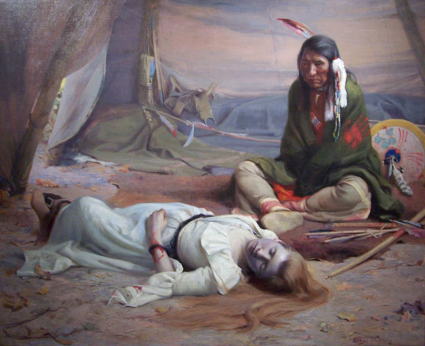
Russ’ Art Blog: Found Drowned
Russ’ Art Blog: Found Drowned
Russ's Art Blog, Russ's Art Talks
Sketchy McSketch Sketch: Sept/Oct
Sketchy McSketch Sketch: Sept/Oct
Russ's Art Blog
More Fun With Photoshop: Scratches
More Fun With Photoshop: Scratches
Russ's Art Blog
Russ’s Art Blog: A Wolf Had Not Been Seen in Salem for Thirty Years
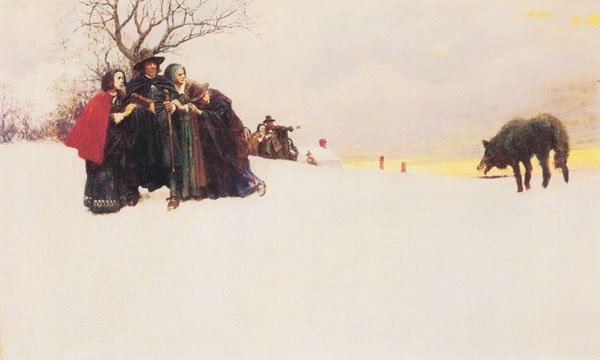
Russ’s Art Blog: A Wolf Had Not Been Seen in Salem for Thirty Years
Russ's Art Blog, Russ's Art Talks
Russ’ Art Blog: The Plague of Rome
Russ’ Art Blog: The Plague of Rome
Russ's Art Blog, Russ's Art Talks
Russ’ Art Blog: Death on a Pale Horse
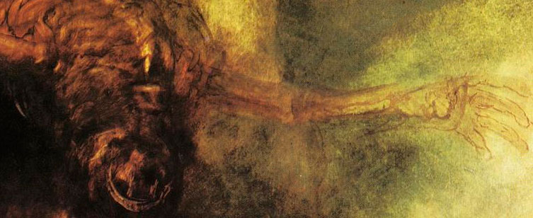
Russ’ Art Blog: Death on a Pale Horse
Russ's Art Blog, Russ's Art Talks
Music and the artist Part 1: Soundtracks
Music and the artist Part 1: Soundtracks
Russ's Art Blog
Russ’s Art Blog: “Pushkin’s Farewell to the Sea”
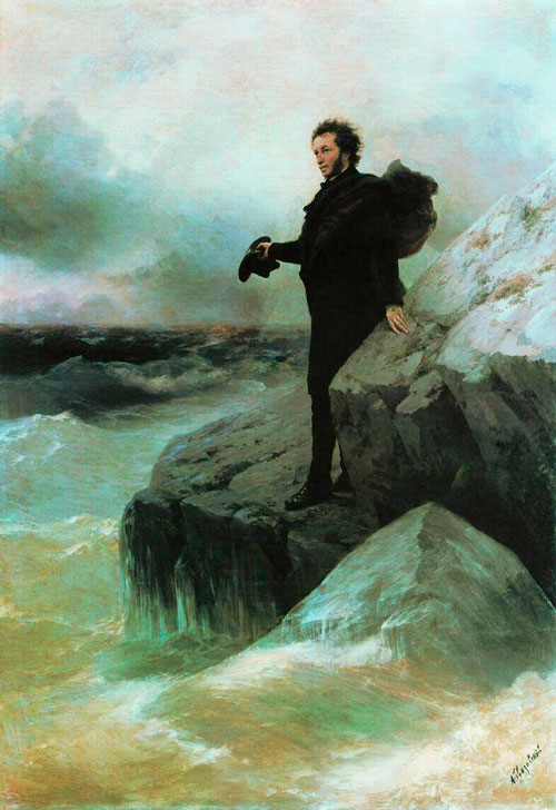
Russ’s Art Blog: “Pushkin’s Farewell to the Sea”
Russ's Art Blog, Russ's Art Talks
Fun with Textures
Fun with Textures
General, Russ's Art Blog
Russ’s Art Blog: Achenbach – “Caught In A Squall”
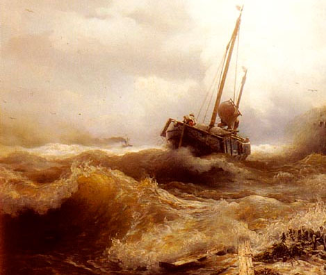
Russ’s Art Blog: Achenbach – “Caught In A Squall”
Russ's Art Blog, Russ's Art Talks
Russ’s Art Blog: Vedder – The Questioner of the Sphinx
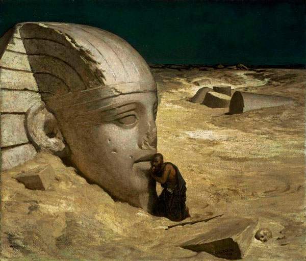
Russ’s Art Blog: Vedder – The Questioner of the Sphinx
Russ's Art Blog, Russ's Art Talks
Russ’s Art Blog: Bierstadt, and seeing it in person
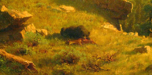
Russ’s Art Blog: Bierstadt, and seeing it in person
Russ's Art Blog, Russ's Art Talks
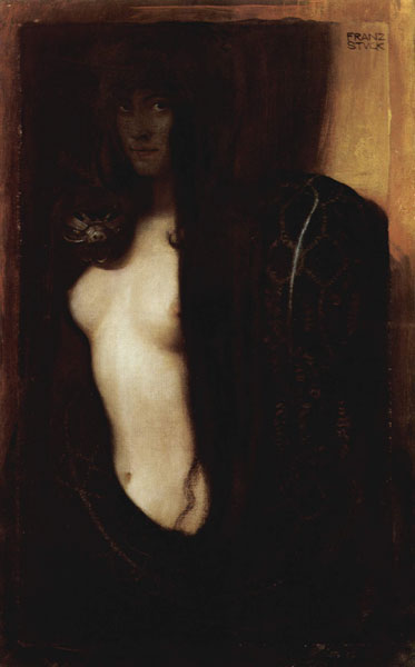
Russ’s Art Blog: Resistance, or The Black Idol
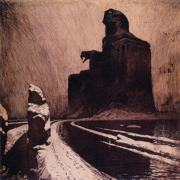
Russ’s Art Blog: Resistance, or The Black Idol
Russ's Art Blog, Russ's Art Talks
Russ’s Art Blog: And the sea gave up the dead
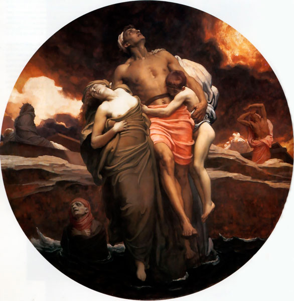
Russ’s Art Blog: And the sea gave up the dead
Russ's Art Blog, Russ's Art Talks
Russ’s Art Blog: N.C. Wyeth, Gunfight
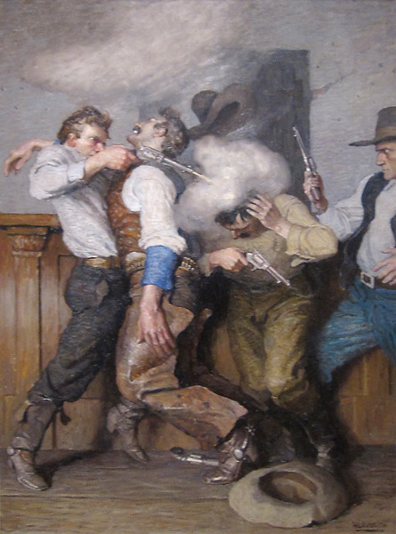
Russ’s Art Blog: N.C. Wyeth, Gunfight
Russ's Art Blog, Russ's Art Talks
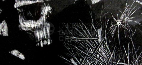
Cheap lamp + skull = anatomy reference
Cheap lamp + skull = anatomy reference
Artwork, General, Russ's Art Blog
Russ’s Art Blog: Frederic Edwin Church, The Icebergs
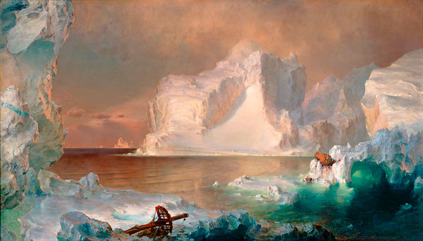
Russ’s Art Blog: Frederic Edwin Church, The Icebergs
Russ's Art Blog, Russ's Art Talks
Russ’s Art Blog: Edd Cartier, Unknown Fantasy Fiction
Russ’s Art Blog: Edd Cartier, Unknown Fantasy Fiction
Design, Russ's Art Blog, Russ's Art Talks
Russ’ art blog: Ivan Shishkin’s Rain in the Oak Grove
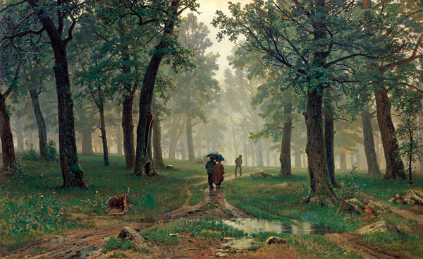
Russ’ art blog: Ivan Shishkin’s Rain in the Oak Grove
Russ's Art Blog, Russ's Art Talks
Russ’ first new art blog of 2009: The Captive
Russ’ first new art blog of 2009: The Captive
Russ's Art Blog, Russ's Art Talks
Art technique books I have
Art technique books I have
Artwork, Russ's Art Blog
Photoshop: fun with warping
Photoshop: fun with warping
Artwork, Design, Russ's Art Blog
Russ’s Art Blog: Seeing it in real life – Pollice Verso
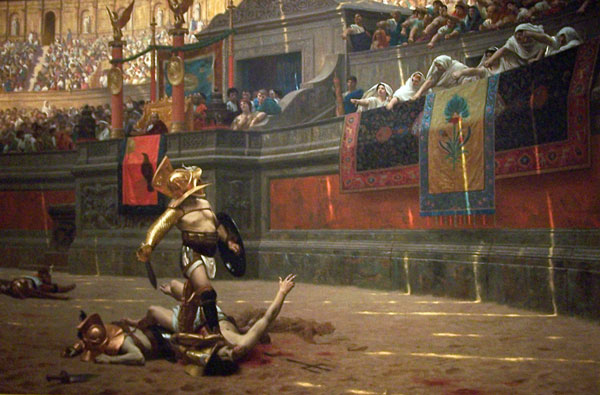
Russ’s Art Blog: Seeing it in real life – Pollice Verso
Russ's Art Blog, Russ's Art Talks
Russ’s Art Blog: Artist Gregory Manchess
Russ’s Art Blog: Artist Gregory Manchess
Russ's Art Blog, Russ's Art Talks
Russ’s Art Blog: Trompe l’oeil
Russ’s Art Blog: Trompe l’oeil
Russ's Art Blog, Russ's Art Talks
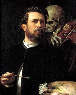
Russ’s Art Blog: Artist Michael Deas
Russ’s Art Blog: Artist Michael Deas
Russ's Art Blog, Russ's Art Talks
The New Art Blog: Assault on Belleau Wood
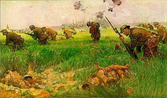
The New Art Blog: Assault on Belleau Wood
Russ's Art Blog, Russ's Art Talks
This Week’s Art: Ivan the Terrible
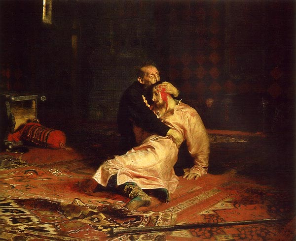
This Week’s Art: Ivan the Terrible
Russ's Art Blog, Russ's Art Talks
This Week’s Art: The Premature Burial
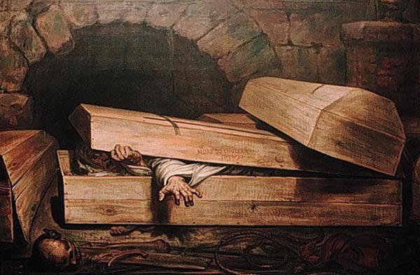
This Week’s Art: The Premature Burial
Russ's Art Blog, Russ's Art Talks
This Week’s Art: The Duel After the Masquerade
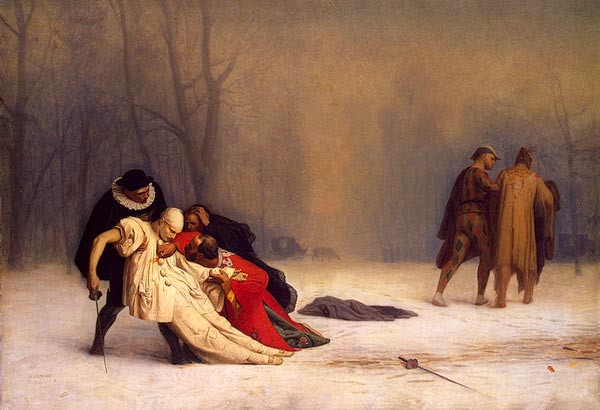
This Week’s Art: The Duel After the Masquerade
Russ's Art Blog, Russ's Art Talks
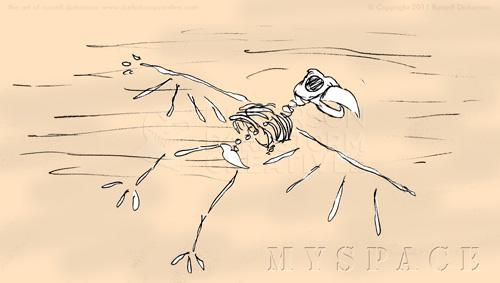
This Week’s Art: Rising of the Bones
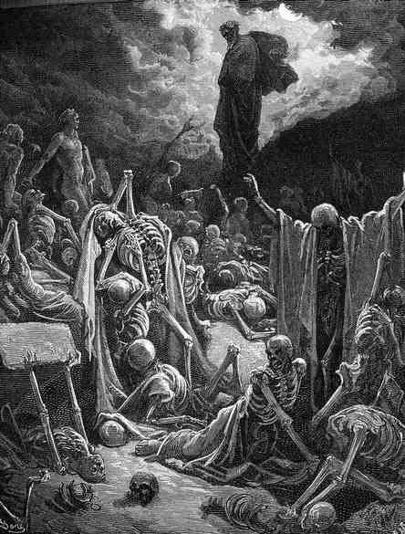
This Week’s Art: Rising of the Bones
Russ's Art Blog, Russ's Art Talks
This Week’s Art: The Dead Stretcher Bearer
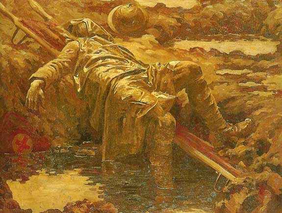
This Week’s Art: The Dead Stretcher Bearer
Russ's Art Blog, Russ's Art Talks
This Week’s Art: Wanderer Above a Sea of Mist
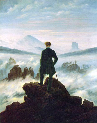
This Week’s Art: Wanderer Above a Sea of Mist
Russ's Art Blog, Russ's Art Talks
This Week’s Art: Expulsion – Moon and Firelight
This Week’s Art: Expulsion – Moon and Firelight
Russ's Art Blog, Russ's Art Talks
This Week’s Art: Remington’s Moonlight, Wolf
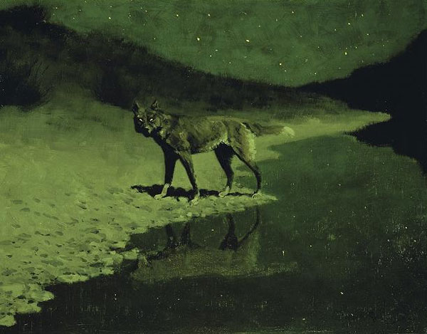
This Week’s Art: Remington’s Moonlight, Wolf
Russ's Art Blog, Russ's Art Talks
This Week’s Art: Poynter’s Faithful unto death
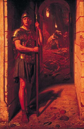
This Week’s Art: Poynter’s Faithful unto death
Russ's Art Blog, Russ's Art Talks
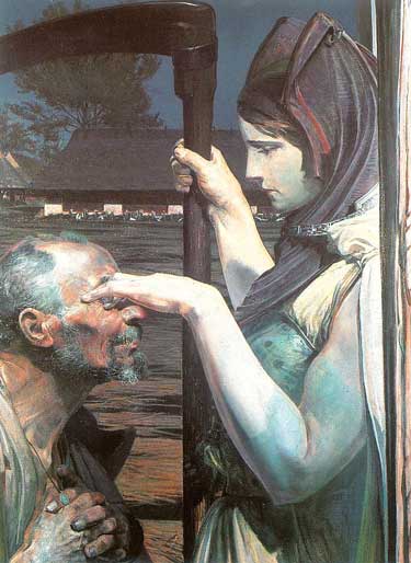
This Week’s Art: Skeletons Warming Themselves
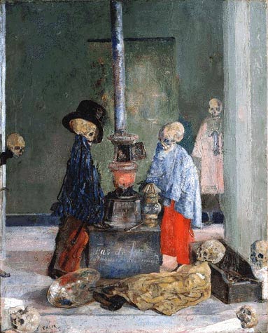
This Week’s Art: Skeletons Warming Themselves
Russ's Art Blog, Russ's Art Talks
This Week’s Art: Schinkel-Medieval
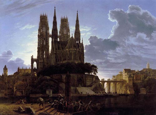
This Week’s Art: Schinkel-Medieval
Russ's Art Blog, Russ's Art Talks
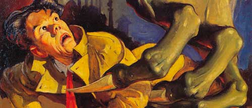
This Week’s Art: Pulp Artist H.J. Ward
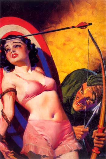
This Week’s Art: Pulp Artist H.J. Ward
Russ's Art Blog, Russ's Art Talks
The light at the end of the tunnel
The light at the end of the tunnel
Russ's Art Blog