I had been thinking of working on some larger pieces lately, and the opportunity to be in a local art show was a great motivator. As with nearly all of my acrylic paintings, I had a pretty good idea to start with. Also, as with all of them, they didn’t end up anywhere near that original idea.
Which happens to me all the time, and I don’t see it as a bad thing at all. I am a tinkerer by my nature, so trying new things and new effects will happen whether I have a good plan or not. With acrylic painting and other traditional media, I just have to remember that there’s no undo. If I mess it up, or if my idea was a stupid one, then I have to cover it up or live with it.
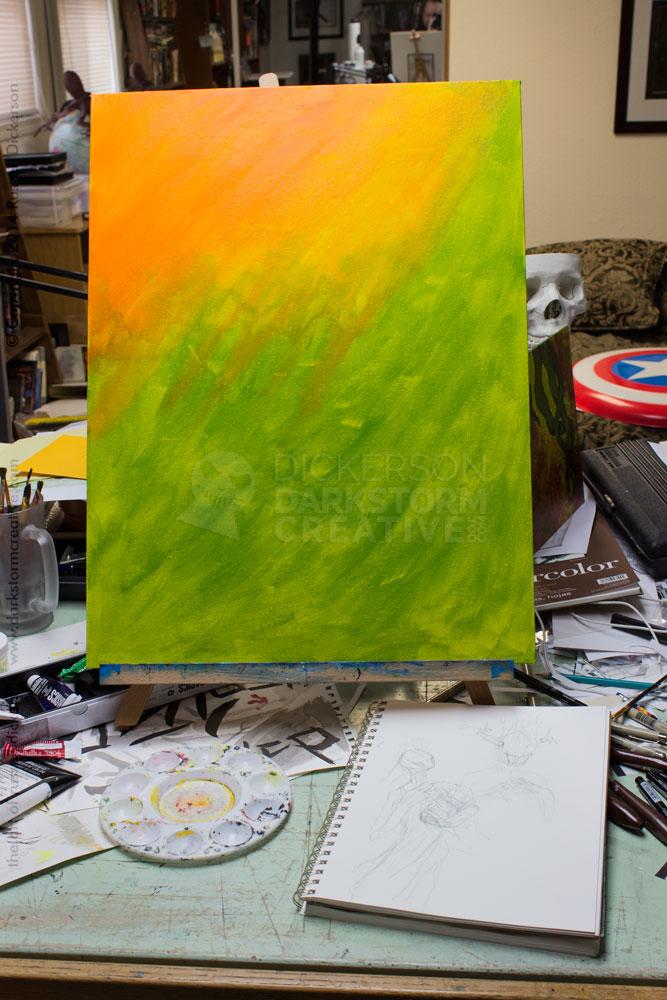
Here’s the start of the work, with the orange and green background of the original idea. You can see the sketch (well, if you click on the image to see it larger) in the foreground, a sort of oddly shaped woman with giant hands. Something akin to the title character/creature of the film Mama.
The idea, originally, was to have her holding a baby-like shape in one arm, and the rather creepy other hand in the air above the wrappings. But, as I painted the background in, I realized that I just didn’t like the idea as much as I thought I did. It happens.
I’ve been wanting to challenge myself with acrylics, to try something slightly more realistic. With digital, I would just go ahead with it and try it. But I don’t yet trust my acrylic painting abilities, since I tend to see those paintings as more “wild” and experimental.
The vision of a ghostly, wrapped and hooded woman has been with me for many years, and has shown up in my work a couple of times. Most notably, a similar creature appears on the cover I did for author S.P. Miskowski’s Delphine Dodd. Which was a stroke of serendipity for me, since a creature like that actually appears in the story.
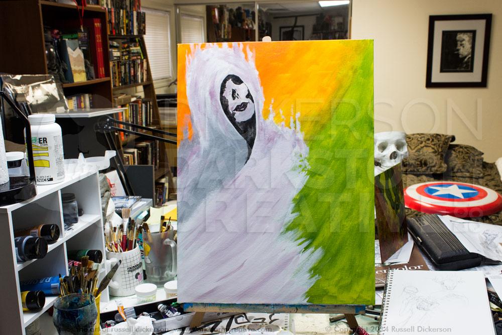
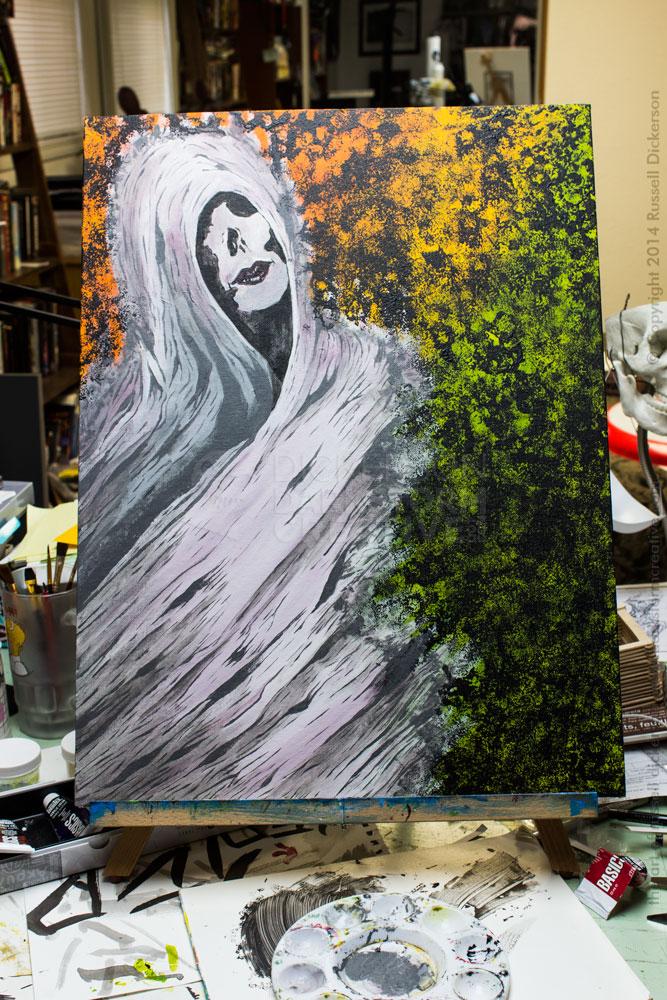
So I grabbed the white paint, gave it just a touch of black to tone it down some, and painted in the extents of the woman. I considered giving her a skull face, then a beautiful woman’s face. In the end, I opted to compromise between the ideas. She has voluptuous lips (opinion), and soft skin, but other parts of her face are either broken off or dark, like a mask.
I then started adding in a darker grey, to indicate where the layers of wrapping overlapped. I brushed in some highlights here and there with white, for effect. Then I took the remaining lip color (a sort of crimson I mixed up), and started mixing that in roughly with the white and grey that I was using. That added a nice secondary tone to her, in a way making her feel a bit more feminine.
At this point, other than the face, these colors are more or less background colors. They are the base for what’s to come, and I could see things working out pretty well. My only problem at this point was, while I really liked the subtle maroon effect, it was making things lean a bit too much into the pastel shades.
The orange and green were always intended to be covered over with a texture, as opposed to being the only background. With the woman now in there, it was very evident that the idea of covering it up was sound. So I grabbed my “texturizer”, which I would use to add a random black texture over the background.
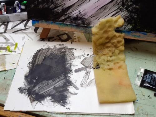
What’s a texturizer, you might ask? The idea comes from a sea sponge, which are quite naturally very plentiful at art stores now. When I had the original idea a few years back, though, I couldn’t find them anywhere (unless I wanted to pay a rather silly amount of money). So, I took a piece of soft packing foam that had been shipped with one of my computer’s parts, and used my fingers to pick out little holes from it.
To use it, I just use a palette knife to spread some paint on a piece of paper painter’s palette. Roll up the foam so that I can hold it, dip it in the paint on the paper, and start dabbling on the canvas in whatever pattern strikes me as cool.
The only thing I watch out for is the randomness of the effect. I twirl the foam each time I dab, with fairly thick paint on it, and try to stay away from a noticeable pattern. There are a few spots where I intend to have a pattern, otherwise I try to keep it loose. I also make sure that the background still shows through it strongly, otherwise I might as well just paint the background black.
In this case, I dab right up next to the woman, but not so much over her. A little, sure, but the intent is to come back later, after I finish her, and dab the remaining black more into her wrappings.
Then I started going over her wrappings with a dark grey, and a little black here and there, to bring out the individual parts of the wrapping. I generally followed the sweeping texture I had laid down at first, making changes to it as I saw fit. I wanted to keep the sweep of the wrappings, it gave a nice motion to the piece.
Why grey first, and not black? A couple of reasons, starting with the idea that if I changed my mind it would be easier to rework over grey than black. But I also thought that the grey would add an extra dimensionality behind the black, and around it.
It would also make the black darker and stronger, instead of it being over white. Over white, the black paint spreads out a bit instead of just filling in black. That works great later on, for shadowing. But where I want a true, deep black, unless I want it to be very thick it’s great to have a darker underlying color that’s not so bright.
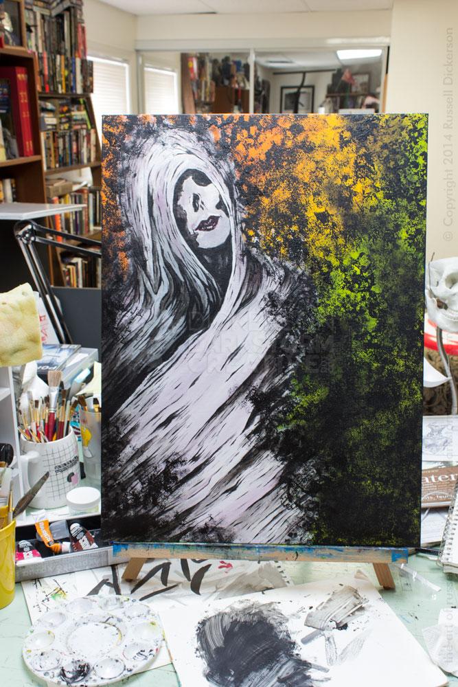
Now she seems really “here”, if you will. She’s an actual character, not a bunch of paint strokes. The grey lines make her look too washed out though, so it’s time to go back through those areas with black paint. Some of that is deep black, putting things in harsher shadows. In other areas, I spread the black paint over the white, which darkens it nicely, yet still allows the underlying color to show through. It’s using the problem of the black over white, from the previous step, to our advantage now.
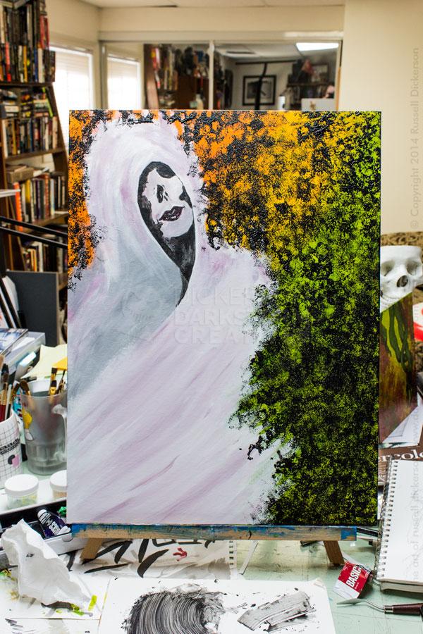
Compared to the previous, grey image, you can see that the black really brings in the sharpness and contrast. I filled in all of the areas that needed black, then ran back over it with the texturizer (which, go figure, WordPress keeps underlining in red, as if it isn’t a word).
You can see that I let the texture override parts of her wrappings, which I thought combined her more with the background. I didn’t want them to be separate, and they seemed more as one after that. I also darkened the lower part of the background with more of a flat black as well, and around her on the left, which I thought focused the image more on her.
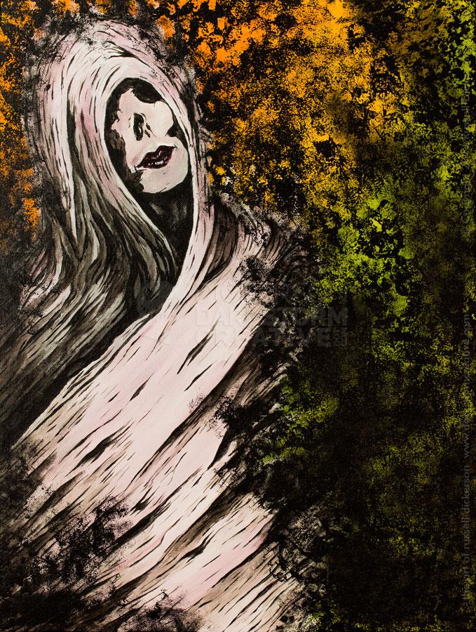
I added a few more finishing touches, mostly to fix the wrappings around her neck. I also added a couple of cracks in her mask (if it is indeed a mask, that’s up to you). Then I took a much better photo of it, since the lighting in my office can be pretty harsh. That’s fine on the progress shots, but for a final piece it needed to be better.
Here she is, the final painting. It is called Lethe, it’s acrylic on canvas panel, 18″ x 24″. Let me know what you think.
