I’ve written quite a few blog articles for the Apex Book Company, and every so often I’ll add a piece of my own art to my writing. Sometimes it’s a pre-existing piece, and every so often I’ll create a brand new piece to go with the article.
The article I wrote for them in October, The Devil’s Footprints: Creating Oddities From The Mysterious, was about my fascination with all things “strange”. I started the article with a discussion of the famous Devil’s Footprints incident (go read the article, I’ll wait), and I thought it needed some kind of art to go with it.
I toyed with a few ideas for cloven footprints, but nothing really twirled my skirt. I decided then to try it from a different angle. Instead of a direct approach with the footprints, I thought a more general, yet more mysterious approach was needed.
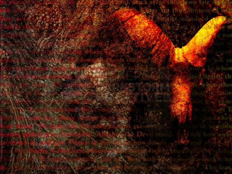
There had been a few general ideas floating around in my head for other projects at the time, and I thought I would try to combine them. One of them featured a ram’s skull, another John Milton’s Paradise Lost, and overall a devilish idea that had been needling me for awhile.
So I gave it a shot.
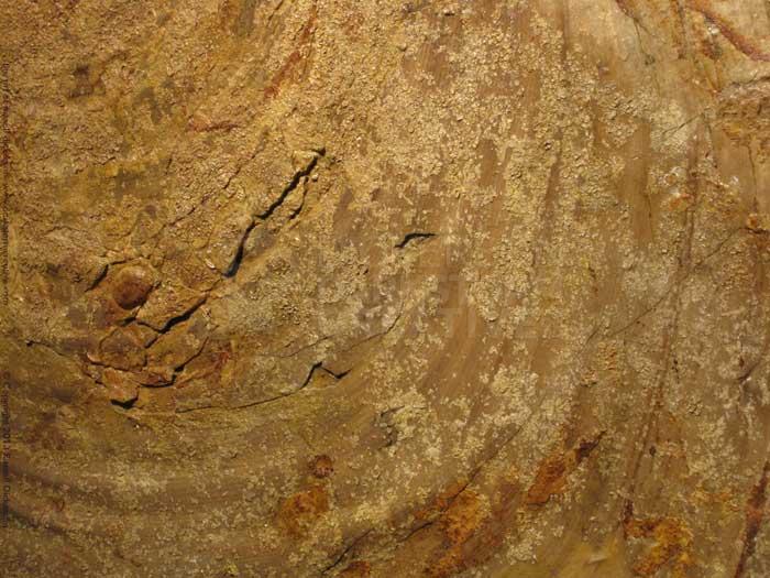
I was pretty open to anything at this point, though I had a couple of ideas floating around in my head. Now, that’s not unusual with my digital pieces. About half of the time, I have a strong idea, sketches, and all of the planning that needs to be done. Other times, and this was one of those, I just like to explore what art is really about. So, we started with the texture of the background, from a photo I took a long time ago.
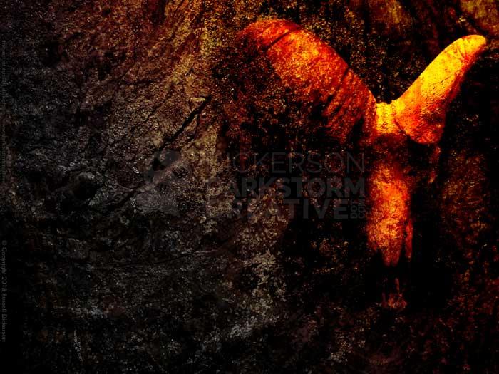
Then, I added a photo of a ram’s skull. I took the photo quite a long time ago, but never quite found the right project to work with it on. Now was the time to see if it worked.
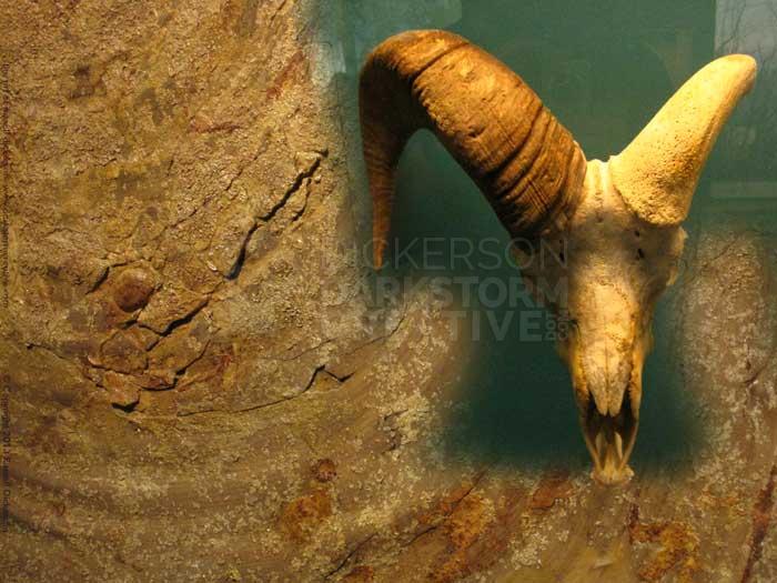
I erased much of the background behind it, and then reached a point that I thought I’d stop and see how a blending mode change (we’re in Photoshop, I probably should mention that) on the layer would affect it. It cycled through them, and I often too, and I stopped on the blending mode called, “overlay”:
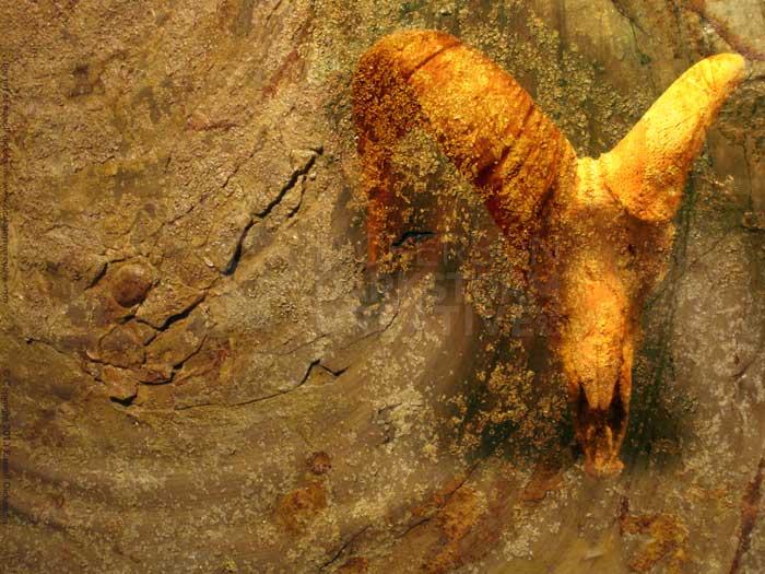
I really liked that effect, so I left it. The green background became part of the texture quite well, so I decided to leave that too.
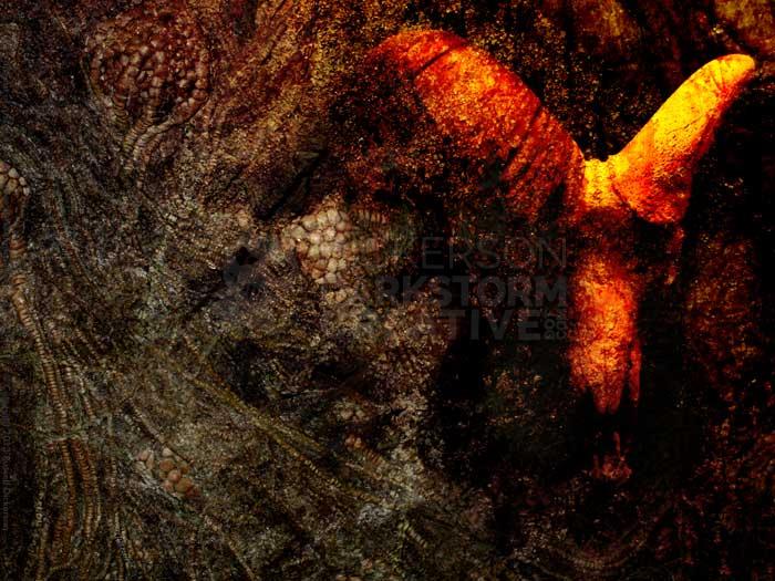
I then added another texture on top of the whole thing. That photo looks like this:

I took the photo at a museum, it’s of prehistoric fossil crinoids. I’ve used it before, it has a nice, Lovecraftian feel to it. I changed the blending mode to “color burn” on the layer, and it turned out like this:
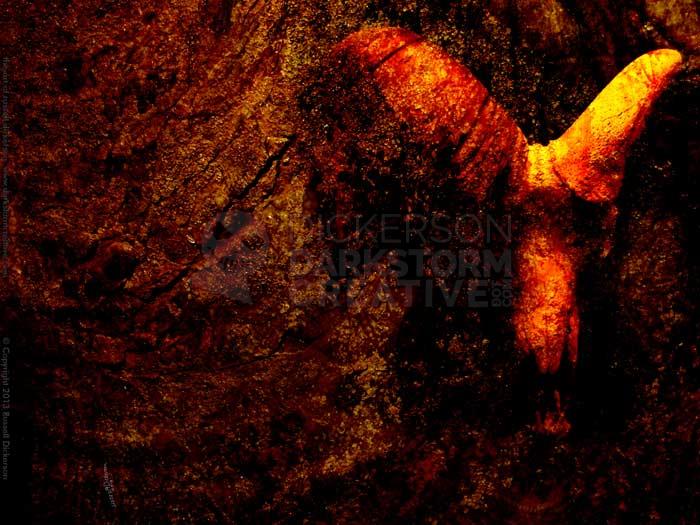
This was one of those, “holy crap!” moments that I’ve had as an artist, and they are always great. It’s that point when you’ve used just the right paint stroke, or just the right ink line, or, as in this case, just the right effect.
I thought that the red was a bit overwhelming, so I duplicated the layer, set the blending mode on the new layer to “color”, then masked out the right side of it with a gradient.
That worked quite a bit better, to bring the eye towards the skull. Otherwise, the red is just too strong all over, and the viewer’s attention would be lost.
For effect, and for the “creepy” factor, I duplicated the layer again and set it to “hard light”. It had a similar mask, so I masked out a few other pieces that were just a bit too strong. I thought the added crinoids added something odd to the piece. Since I had already started thinking of the step after this, I thought the effect would work well.
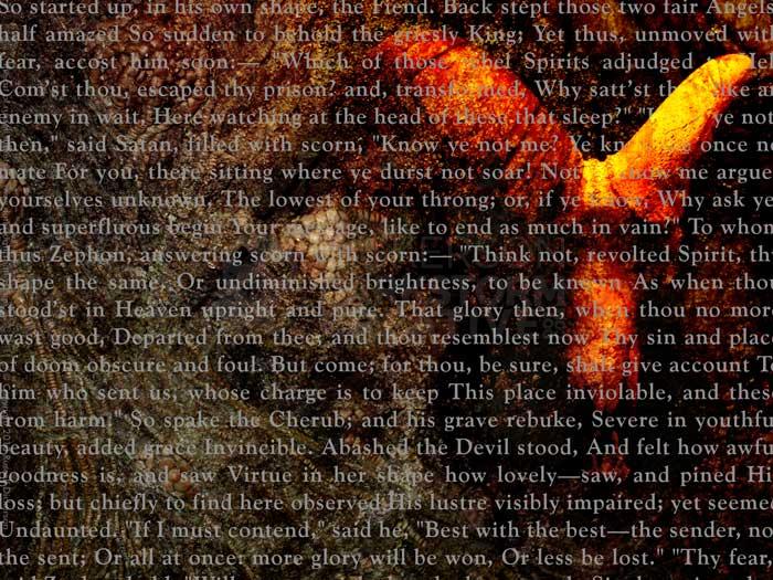
That next step was to add text on top of the art. I don’t add typography to art all that often, but it can be fun. Much of time, after I tinker with it for a bit, I just delete the text and stick with the art. In this case, though, I thought it worked well.
The first step was to add the appropriate Paradise Lost section into Photoshop, on top of the art. Then it was just a matter of messing with it until it fit the way I wanted it to. I like the effect of text like this feeling as if we’re just seeing part of it. For that, I just made the block of text slightly larger than the page itself.
I set the text’s layer blending mode to “lighter color”, so that it wouldn’t affect the bright parts of the ram’s skull as much. Then I gave the text a layer effect, a color gradient, which gave it a nice effect.
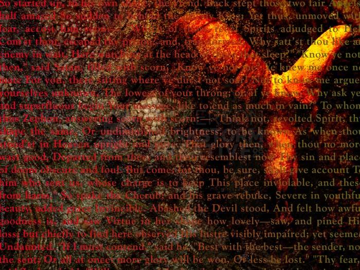
The text is too strong at this point, of course. If my point was to apply text over an image, it would probably be fine. But the intent here is to use the text as an accent, so I need to bring the art back into it. I could just mask it out, but a better idea would be to alter the text as well.
So I blurred the crap out of it.

Obviously, that loses half the point in the process, since the words are practically unreadable. So I went back into the text layer’s mask, and hand-painted back in (with a wide airbrush) certain areas of text. Namely, “abashed the devil stood”. That not only gives a nice effect to the text, but it brings the art a little closer to us in a “field of focus” manner.

Since that still left a bit too much text on the image, I went back in to the overall text layer mask and hid some of the text. That brought out the art more, and really completed the piece.
Here is the final image, my piece Abashed The Devil. Let me know what you think.