I’ve been very fortunate to have created art for several of S.P. Miskowski’s books, they are wonderfully written books that everyone should check out. I’ve just completed both the illustration and design of her latest cover, a book called Astoria.
After you are done ordering it, come back here and read about how I created it. I’ll wait patiently.
All done? Here we go.
S.P. Miskowski is a very “visual” author, and working with authors like that often make it easier for me to come up with a cover. Astoria is no exception to that, as there are great visuals throughout the book for me to choose from.
As is usually the case, I started with some sketches. I had a pretty clear idea from the start about what I wanted to do, but I also think it’s valuable to explore your options as well. On top of that, I don’t like to think of my creations as flat, two-dimensional representations of the world. I like to think of every possible angle in the image, even things that will never be seen.
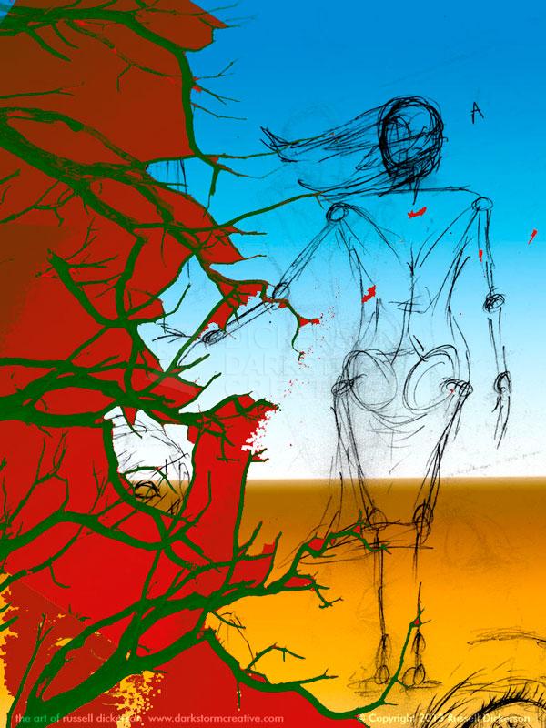
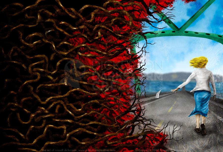
For example, it’s not just that I wanted to draw the main character, Ethel, from behind. I wanted to know if she was crying, what that might look like from her side or front. I wanted to visualize her despair from all angles, to better know how to represent her. In the case of the branches that fill the back cover and spine, I wanted to see them pushing in and around each other, a violent mess of horror and terror.
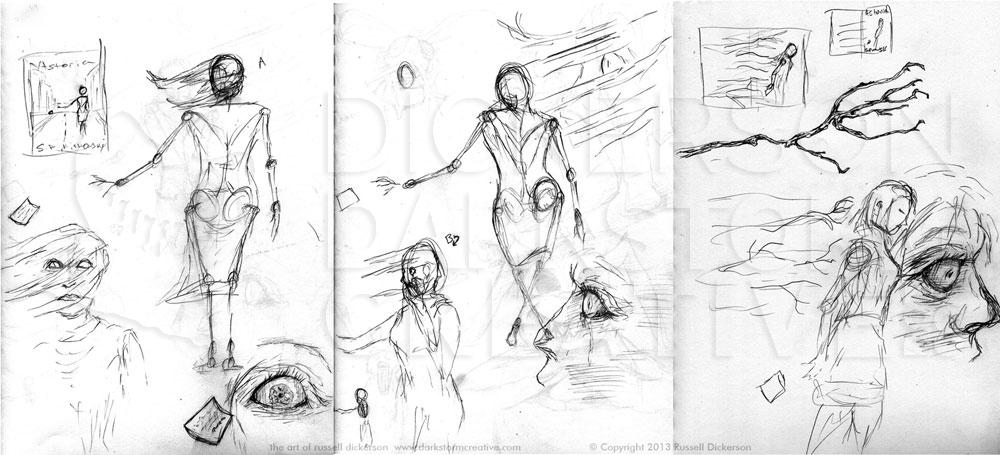
Click on this, and all of the images, for larger versions
Is it overkill? Some might say so. But for me, I want to live in that world while I’m creating it. If I can’t feel what’s going on, as if it were real and from all directions, how could I possibly represent it well?
After we started whittling down the idea a bit, I had to try and explain my idea for the branches that were coming in so dramatically in my head. I probably sounded something like, “there are these branches, see, and some red stuff in the background, and then they intertwine… not the red and the branches… well, yes the red and the branches…”
So, I quickly mocked up a color version with some rough gradients and an old photo of branches. Sometimes it’s just easier to show what you’re thinking, even if it’s rough it’s probably a better idea than just an explanation.
Once we all saw where it was heading, I created the correct size layout in Photoshop, gave it some guidelines for where the margins, spine, and so on were.
I tend to start images in completely different spots every time. I just let it flow organically, and let my brain tell me where to go. In my early days, I would often fight that. I would force my way into the character creation first, or the background, without a real direction. So now, I just let it go and follow along.
In this case, the wicked branches called out to me, so I started with those. I wanted them to be malevolent, almost cruel, so I worked out some Photoshop brushes to give me the right texture. Then I started hand painting them in, sometimes next to each other, sometimes over each other, and then went back with black to hide where they intertwined. Definitely click on the image below for the larger version.
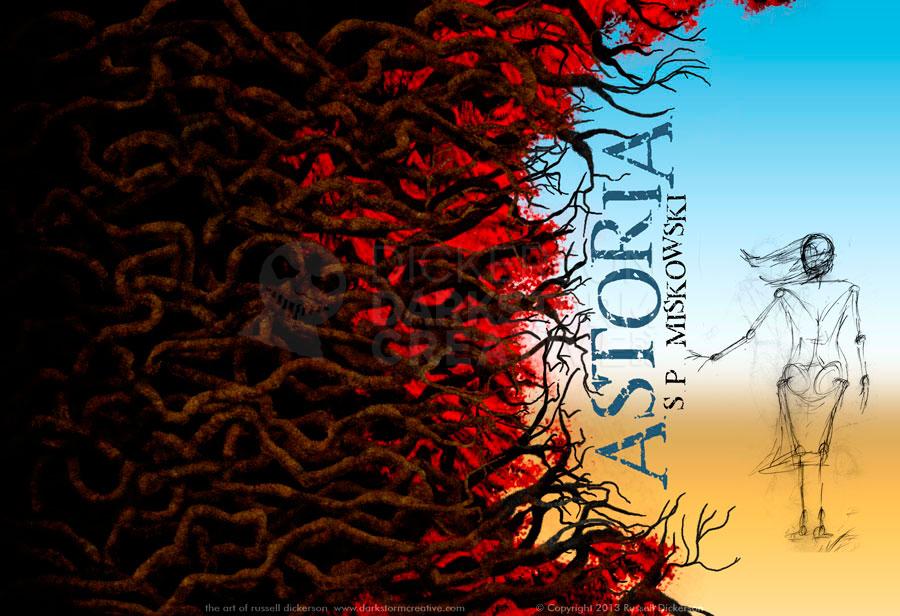
I thought I would make some changes, maybe brighten the branches here and there, but I decided to get the reaction from both S.P. and Kate Jonez, owner of publisher Omnium Gatherum. We agreed on making them a bit more “knobby”, and that some of the parts were a bit brighter, so I went to it.
Using a combination of Photoshop’s Smudge tool and Dodge/Burn tools, I created a much sharper look in the branches. I thought they ended up looking very mean, which in this case is perfect.
At this point, my quick gradient background wasn’t going to hold up any longer. I had found a number of photo references of the bridge in the story, and several of them led down from the bridge towards the shore (the bridge itself goes way up and over the river). I thought that was a good angle to work with, and S.P. had specifically asked that the bridge be in there somehow, so I went to it.
I started laying in the river, which was a combination of color airbrushing and the smudge tool, as well as some burning and dodging. I realized that I needed to “contain” the river somehow, so I added the background hills. I left them fairly rough, I knew I’d eventually blur the background a bit to keep the focus on Ethel.
For the road, I started with a basic grey box. Then I reformed it (and its various copies) to match the perspective I wanted. Part of the trick was not having a road that was too dark, I wanted to keep this side of the cover in an almost pastel state. A softer, more pastel-style feel to Ethel’s side would counteract the harshness of the branches, so a black road would kill that effect.
I added the overhead bridge elements, based on the unique color of the real bridge. I was forced to “cheat” reality a bit, because the final curve of the support, in real life and at this perspective, would be far closer to Ethel. That would interfere with Ethel, so I pushed those supports back towards us. That pushed the upper curved support higher in the image, and it worked better overall.
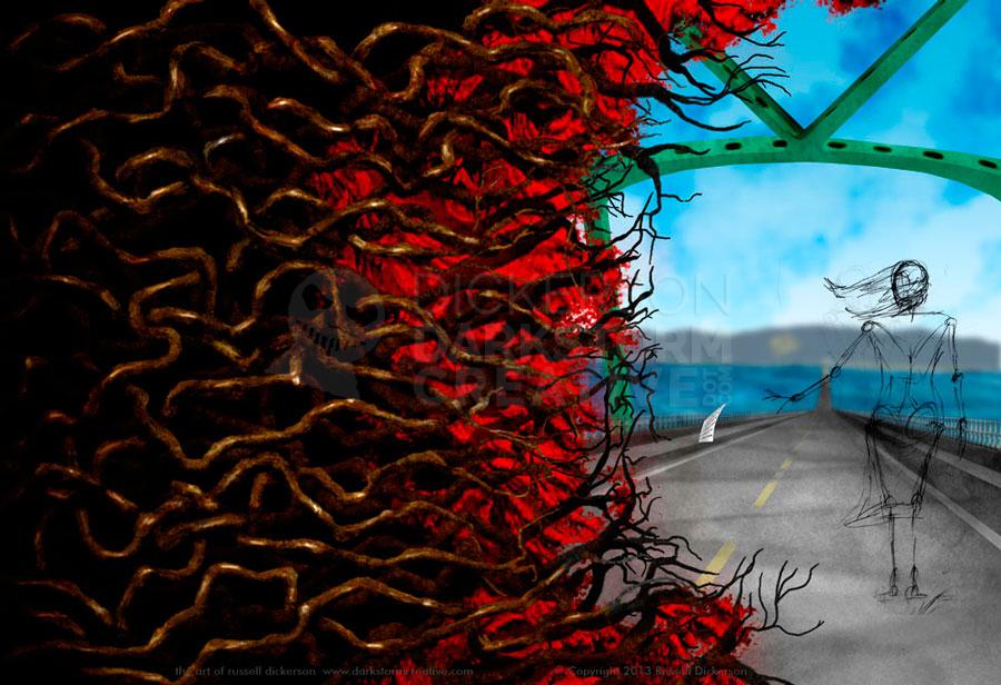
You can still see the farther shadows of the bridge supports on the road in the image above, so I went back and took those out. The final piece still leaves in some right at Ethel’s point.
From here, I worked on the character. The challenge with her was to give her enough contrast so that she look right, but leave her soft enough visually to match the pastel fell of her half of the image. After toying with her look for a bit, I was satisfied with how she looked.
I added a final bit of texture around her on the right and beneath, and a secondary, fainter texture closer to the branches. I thought the line between dark and light was a bit too strong, especially considering the story. I thought a roughness to the areas near the edges would work well for that.
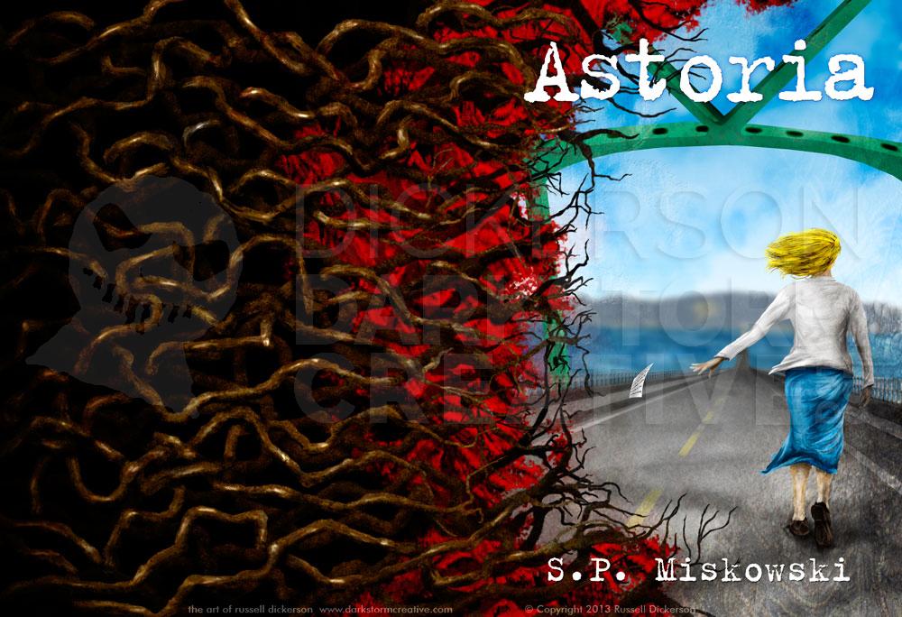
Here’s the final art, my cover for S.P. Miskowski’s Astoria.
Here’s what it looks like with the title and author’s name on it, which I also created. We had discussed some other layout and font options, but in the end we decided for continuity of the series that it should have the same font as Delphine Dodd and Knock Knock.
As always, let me know what you think. Feel free to comment here, or on any of my social networks.