Today has been an experiment in not only a larger format for an ink work, but also in the idea of not letting a problem in the art end the day.
When I started doing art today, I just grabbed my 12″ x 18″ watercolor stock and went to work. I had a decent idea for a larger piece, but one that was still consistent with the other cards that I have been doing. I even took some measurements, and decided it might be time to base an image on more specific requirements than just “where I want it”.
Now, with digital work, that’s certainly nothing new. I’ve done that for years, and in many ways, especially as a cover artist, I absolutely must do it that way. But in this case, being just another piece of art, I had some leeway with it.
Here’s how it all started:

It was all off to a pretty good start, and then, after some further measurements, I figured out that I had a severe problem with it. The character’s hand should appear on the left side of the page, as he is holding it up. But my measurements were only close, not perfect. So the edge of his hand fell off the page. Not a ridiculous amount, just a half an inch.
But it was enough for me to scrap that original idea. Almost to scrap the whole thing and run off to the mountains to become a goat herder.
Reason, and a break for lunch, finally came to pass. I realized that I don’t have to completely destroy the work, I just need to reevaluate the original idea and adapt it to the new conditions. So, out came the scissors:

From here, I started laying in whatever lines I could lightly, and crosshatched part of his neck, to tentatively see if it would work. I added some more black, and decided to keep going.

I finally settled down and realized that it was working, just not the original idea. With some more black for the background, and a hell of a lot more crosshatching, I finished it.
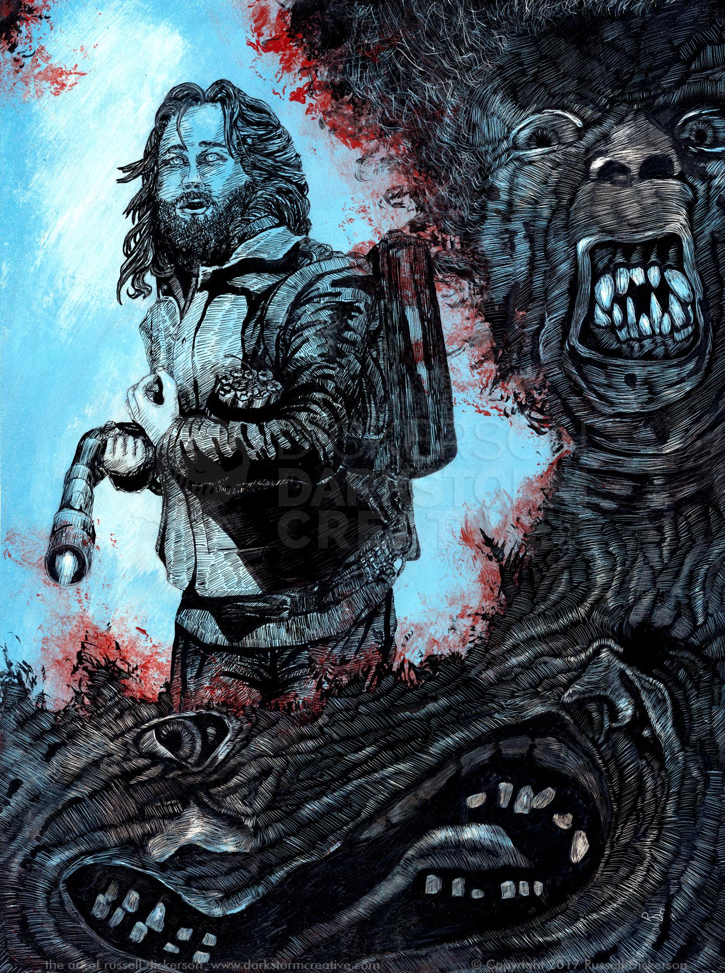
While it’s not what I originally intended, I’m still happy with it. With all of these inks I’ve done I’ve aimed to capture the idea and the characters respectfully and accurately, yet still alter things as I go. It gives them a certain style that’s mine, though it’s pretty subtle.
Ladies and gentleman, I give you The Pale Man, from the film Pan’s Labyrinth. There’s also a larger version here. It’s approximately 8 1/2″ x 12″, ink on 140 lb. Cold Press.

I also decided to add some color to it, so when I scanned it in I added colors and textures in Photoshop. Now I don’t know which one I like better. You let me know.

5 Comments
Amanda @geekdetails · March 8, 2011 at 7:26 pm
I like the color version! You did a great job shading it.
admin · March 8, 2011 at 7:27 pm
Thanks! I thought I’d see how it would turn out, and I think it worked out pretty well. Now I can’t decide which one I like better.
Shadow · March 9, 2011 at 8:11 am
It is awesome! I love the color version. That ads so much to the overall shock factor.
admin · March 9, 2011 at 8:17 am
It definitely gives it a certain “darker” feeling, and maybe makes it more aggressive. It was fun to try, I might do it on a few more of my inks. Thanks!
Film Poster Designs: Pan’s Labyrinth » Darkstorm Creative: The Works of Russell Dickerson · March 6, 2014 at 7:13 am
[…] Fauno, or Pan’s Labyrinth. I’d previously created ink works of some of the creatures (namely this one), and I thought I’d give a shot to some movie poster […]
Comments are closed.